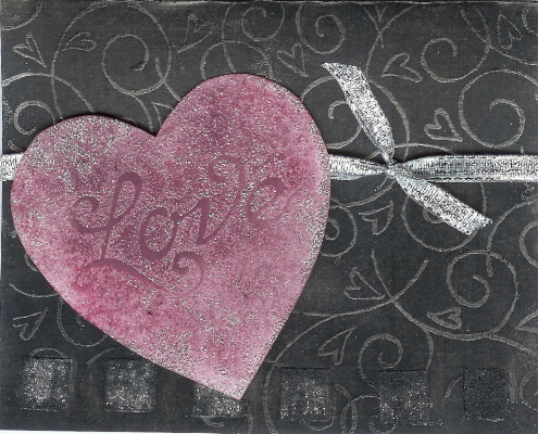
A Study in Contrasts: I did this in white and silver, but didn't like it when it was finished, so sponged over the whole thing with black pigment ink and red chalk ink. The difference amazed me. I still don't really like the cards, but thought the study in contrasts made it worth posting.
For WT72--I used mounting squares on the bottom of the card and covered them with silver glitter. On the black card IRL they are still very sparkly--the sparkles didn't show up in the scan.
Date: Thursday, August 3, 2006 GMT Views: 1259
Favorited:2