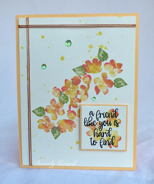
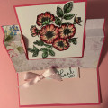
I originally thought this would feel more like a fall card ... but after comparing a couple of pastel colors & a couple of richer colors, this hit the spot for me.
Thanks for looking!
Date: Tuesday, October 5, 2021 GMT Views: 1067
Favorited:7
Splitcoast Dirty Dozen Creative Crew SU Design Team Alumni
Registered: May 18, 2004 Location: Southwest Michigan Posts: 37113
Tue, Oct 05, 2021 @ 7:12 PM
Love the colors you chose for these water color looking petals, Bev; I love these stamps! I like the use of the cord to divide the panel and I forgot how pretty that Apricot Appeal color was! Mine is gone : (
------------------------------ Claudia Splitcoast Fan Club Member
Registered: July 4, 2014 Location: Modesto, CA Posts: 5909
Tue, Oct 05, 2021 @ 11:18 PM
That stamp set sure gives a water color feel. Perfect for the lighter shades of autumn.
------------------------------ Visit the Sketch Challenge on Wednesdays! Take the DOUBLE DARE on the 2nd Wednesday of the month with a fun fold & sketch.
Jeremiah 29:11 Splitcoast Dirty Dozen Alumni | Proud FanClub member since 2017
My Gallery | My Blog "The wind of Heaven is that which blows between a horse's ears."
Registered: August 21, 2007 Location: Wayland MA Posts: 105275
Wed, Oct 06, 2021 @ 10:10 AM
Bev, I love your card with the spray of flowers, and repeated in the saying. Gorgeous colors!!
------------------------------ Anne HarmonFS154, QFTD58, PROUD FAN CLUB MEMBER (photo of our Great Granddaughter Elise, just 6 months old) and me, even older.