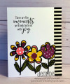
Love the bright bold colors this week so I went for a bright, bold card! I thought about watercoloring behind the die outlines but opted to go for a graphic look.
I played around with other patterned paper for the flowers but decided that the dots were the way to go, especially since I had two different size dots. I always like the contrast of dots and stripes - therefore the striped washi tape on the side.
I'm not exactly sure this sentiment is perfect for the time right now, but maybe we'll all look back on this as "the joyful time". In any event, this sentiment will work at some point!
Date: Monday, May 4, 2020 GMT Views: 922
Favorited:2
Registered: April 14, 2006 Location: Knoxville, Tennessee Posts: 2158
Mon, May 04, 2020 @ 10:01 PM
This is a bold, whimsical set of flowers that shows off the colors so well. A The black and white stripe further makes this card a bold and bright addition!!!
Registered: August 21, 2007 Location: Wayland MA Posts: 105182
Tue, May 05, 2020 @ 6:55 AM
These stylized flowers are fun!! Not sure about the sentiment, though!
------------------------------ Anne HarmonFS154, QFTD58, PROUD FAN CLUB MEMBER (photo of our Great Granddaughter Elise, just 6 months old) and me, even older.
Registered: April 16, 2008 Location: Meridian, Idaho Posts: 8507
Tue, May 05, 2020 @ 7:33 PM
Jeanne, your paper pieced flowers are cute and fun, and the black and white striped strip of dsp down the side is the perfect contrast to complete your graphic beauty! LOVE this card!
------------------------------ Stef
Splitcoast Color Challenge Design Team Splitcoast Dirty Dozen Alumni
Registered: January 8, 2011 Location: Sydney, Australia Posts: 40381
Tue, May 05, 2020 @ 8:04 PM
Your bold striking flowers look fabulous in these colours, Jeanne, and I love the striped washi tape! The sentiment is a lovely one and let us all hope there is more joy on the other side of this awful pandemic ~
------------------------------ Sue
Fan Club Member QFTD143 FS420