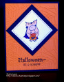
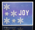
This is for today's CAS and Technique Lover's Challenges. I like the look of the two tone die cut word. But now that I have the card together I'm thinking I should have sponged on some green Distress ink to the top half of the word. Maybe I'll make another card after work and try that.
Thanks for the fun challenges and for taking a look.
Date: Monday, September 10, 2018 GMT Views: 540
Favorited:2
Splitcoast Dirty Dozen Alumni SCS Gallery Moderator Splitcoast Challenge Hostess Teapot Tuesday TEAm
Registered: July 27, 2007 Location: Dublin, Ireland Posts: 131541
Mon, Sep 10, 2018 @ 10:20 AM
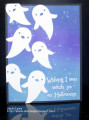
What a beautiful soft background. I think the white sentiment looks good on it, I guess it depends on whether you want contrast, or a green which would be more coordinating. The white picks up well on the soft spattering.
Registered: April 1, 2012 Location: Rogers, AR Posts: 28836
Wed, Sep 12, 2018 @ 6:32 PM
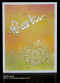
Wow your heat embossing really is beautiful - and the delicate lines are hard to do in the heat embossing! You did a perfect job!!
------------------------------ Jan 'Being confident of this very thing, that he which hath begun a good work in you will perform it until the day of Jesus Christ'. Philippians 1:6