This was by far the worst card to photograph EVER! I had a beautiful Tranquil Tide match but in EVERY photo it was coming out Turquoise on the acorn and Tranquil Tide everywhere else...go figure :(
Needless to say I gave up on the photo war lol
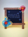
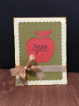
On to card directions...I started with cream cardstock and sponged coordinating Distress Ink. Then I stamped my sentiment scripture, sprayed the panel with water and then embossed the panel with a swirly folder. Every layer was distressed and edges inked. A Martha Stewart punch was used for the two corner pieces. Close to My Heart leaves were fussy cut. A SU acorn was punched out of coordinating cardstock and popped up with adhesive foam. As a final touch I added mother of pearl iridescent gems
Date: Tuesday, August 29, 2017 GMT Views: 971
Favorited:2
Registered: October 18, 2015 Location: Cary, NC Posts: 19903
Wed, Aug 30, 2017 @ 4:32 AM
Your card looks great! Love the background! And trust me Nicki, you aren't the only one that has trouble photographing a card! I can take a picture of a card in any location of my studio, and end up with totally crazy colors!
Oh, how fun! I love the embossed and sponged main layer! I struggle with photographing some colors too! It looks like it's a close match and then I photograph and it's a far cry! This looks good though!!! I love the way you did the corners! Great scripture!
Registered: August 21, 2007 Location: Wayland MA Posts: 105090
Wed, Aug 30, 2017 @ 12:01 PM
Love the acorn and leaves in the top corner. Great shabby card!
------------------------------ Anne HarmonFS154, QFTD58, PROUD FAN CLUB MEMBER (photo of our Great Granddaughter Elise, just 6 months old) and me, even older.