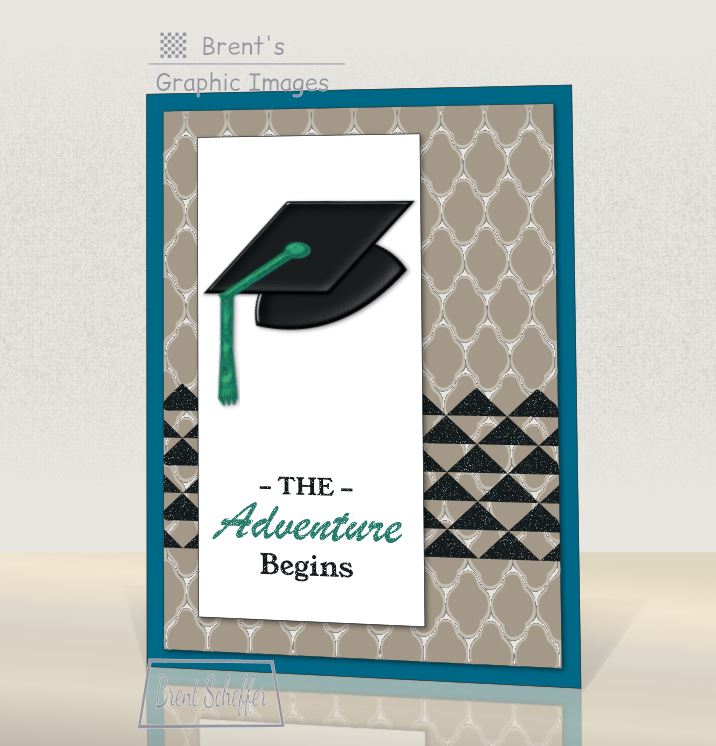
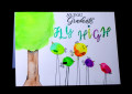
Design influenced by The Paper Players PP351 | "The Adventure Begins" | Digital Project | A Black graduation cap die-cut (with Tranquil Tide tassel) and greeting stamps are over a plain white (w/black border) paper. The plain white DSP and Basic Black triangle stamp structure is over a Tip Top Taupe circular pattern base. A Dapper Denim plain paper base is at the bottom. | Created via #Inkscape | by brentsCards
Dapper Denim plain: Dapper Denim (with Basic Black border) plain 5 by 7 inch rectangle
Tip Top Taupe Rounded Pattern Paper (from bottom):
(1). Base: Tip Top Taupe (with thin Basic Black border) plain rectangle
(2). Gray Horizontal Shadows: Whisper White (Opacity: 72%) with Filter (Thin Membrane) rounded shapes
Basic Black Triangle Stamp Horizontal Group: Basic Black with Filter (Dots Transparency)
Whisper White Paper: Whisper White (with thick Basic Black border) plain [shadow]
Basic Black Hat (Skull-Cap and Mortarboard ) Die-Cut: Basic Black with Filters (Button) (acrylic appearance) [shadow]
Tranquil Tide Tassel (button and Tail (in two parts) (from bottom):
1. Base: Tranquil Tide plain [shadow]
2. Acrylic Texture: Tranquil Tide (Opacity: 35%) with Filter (Eroded Metal)
Black Text Stamp: Basic Black with Filter (Dots Transparency)
Tranquil Tide Text Stamp (times two): Tranquil Tide with Filter (Dots Transparency)
[shadow]: Filter (Drop Shadow)
Date: Monday, July 3, 2017 GMT Views: 1921
Favorited:5
Registered: September 30, 2015 Location: Hawkes Bay, New Zealand Posts: 71
Tue, Jul 04, 2017 @ 2:34 AM
I do really like the way the strong colours - Tranquil Tide and Dapper Denim - work so well in accenting the neutrals. I also really like the strong lines you've created with the black triangles and straight edges and how these contrast with the rounded Taupe shapes so stylishly. Thanks for joining us at The Paper Players this week.
Registered: April 27, 2014 Location: Northampton, UK Posts: 147
Wed, Jul 05, 2017 @ 1:43 AM
Great layering on your card this week Brent and your graduation cap has a real 3D look about it. I love the way you've given the appearance of sparkle to your black triangles and sentiment and highlighted the word 'adventure' to add emphasis. All in all a great graduation card. Thanks for playing along with my challenge over at The Paper Players this week!
Registered: May 23, 2009 Location: sunny california Posts: 9825
Fri, Jul 07, 2017 @ 7:26 AM
I was looking at your gallery and i like your bold, graphic style....a distinct contrast to my "throw everything on the page and see what happens" technique. The black triangles and bright white vertical panel are very eye catching.
Brent, your graphic images just keep getting better and better! This graduation card is awesome. Thanks so much for playing along with us this week at The Paper Players!