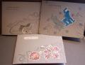
F4A384 we were challenged to get out a neglected background stamp. I do not remember the last time I used French Filigree and this was the perfect time to get it out and play.
I've been wanting to play a little with the distress oxide inks and this was perfect. For the card on the left, I heat embossed the background stamp before inking the background up with the many colors and layers of ink. The card on the right I did the heat embossing after I had the background how I wanted it. I wanted to compare the two ways and see if I thought one way looked better or not. I don't really see a difference but perhaps you do? I didn't heat the card on the left as much between layers because of the embossing that was already there.
After finishing the backgrounds, I sprayed them both with glitter spray. They sparkle like crazy in real life, I'm sorry the camera just doesn't pick that up. If it didn't sparkle so much, I'd probably randomly add some sequins but I think it is good the way it is.
I die cut the sentiments but then decided they needed a shadow so out came the black cs and fussy cutting.
It was fun to play with the oxide inks and ink up a background stamp again.
Thanks for looking!
Date: Friday, June 30, 2017 GMT Views: 785
Favorited:7
Registered: August 10, 2006 Location: Sunny Florida Posts: 25290
Fri, Jun 30, 2017 @ 9:13 PM
Oh my gosh, Catherine! These two cards are striking with the remarkable backgrounds you created! I LOVE the colors, and Orchid Opulence is one of my old time favorites! What a fantastic response to the challenge! (If only our cameras would pick up sparkles!!!)
Registered: March 19, 2011 Location: Chicagoland Posts: 107
Fri, Jun 30, 2017 @ 9:27 PM
Wow, what beautiful backgrounds you've created here! They are both lovely. I agree that there isn't really a difference between the two, although I'd say the embossing does seem to show a bit more on the second card - when it was embossed after the background was created. Thanks for sharing, it inspires me to want to play with those oxides more. I'm so excited that more colors are coming out!!
Registered: December 3, 2009 Location: Central PA Posts: 58003
Sat, Jul 01, 2017 @ 6:19 AM
Love them both. I think the one on the right seems a bit crisper in color, but that may be because of the color of the base. Either way, they are both gorgeous!
Registered: June 23, 2006 Location: Chicagoland, IL Posts: 6729
Sat, Jul 01, 2017 @ 11:34 AM
There seems to be a slight bit more water drop details in the card on the right, but both backgrounds turned out really pretty. I love the way you added the sentiments too. I'm sure it was a lot of fussy cutting, but the black mats behind the sentiments really make them stand out.
Registered: October 12, 2007 Location: Arizona Posts: 70107
Sat, Jul 01, 2017 @ 6:16 PM
Tremendous! Love the colors and the patterns within the color. The background stamp is one of my favorites, but {sigh} I don't use it as much as I could. It looks fabulous on your background. I can't tell a difference between the two methods. Love the layered die-cut words with sparkle and long tails. Well done! TFS