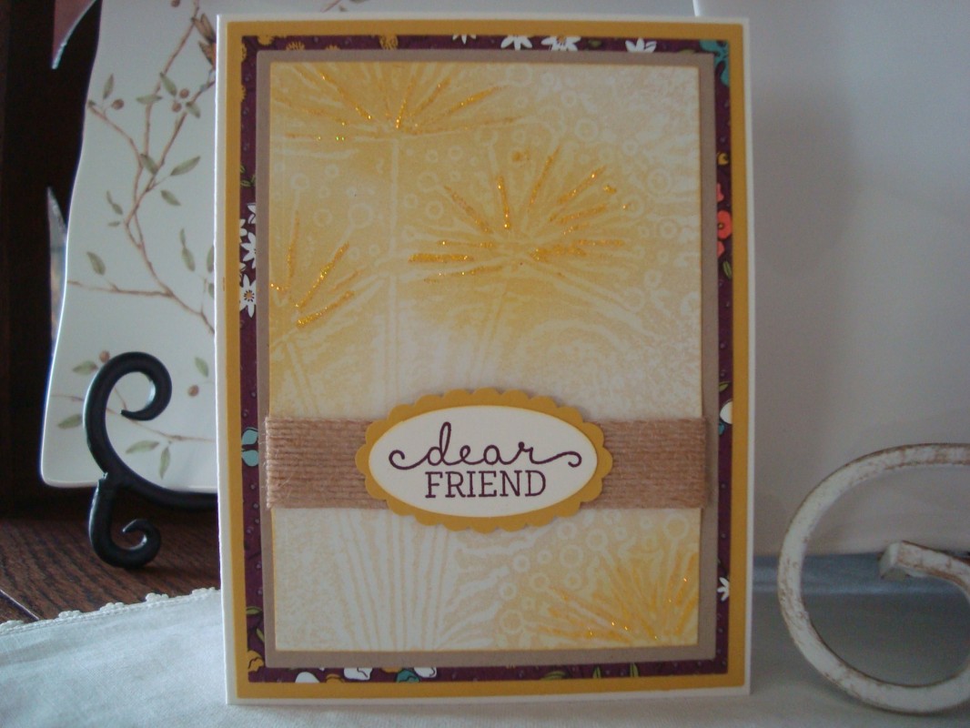
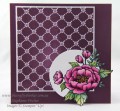
My first attempt didn't really show all that well. My 2nd attempt, I used the bristol that Kathy suggested and a different e.f. Sponged first with old paper distress and then added some DOX fossilized amber. Added some yellow stickles.
Date: Monday, June 5, 2017 GMT Views: 620
Favorited:2
Registered: March 8, 2005 Location: Halfway between Dallas and Houston Posts: 23966
Mon, Jun 05, 2017 @ 7:48 PM
The stickles makes your flowers shine through. I like the subtle background though , too! I just put the ink pad directly on my backgrounds because it was taking too lone to sponge on the ink. Then I sponged off the excess. Got some nice dark contrast that way.
------------------------------ Proud Fan Club Member
Dirty Dozen Alumni
"Art washes away from the soul the dust of everyday life."
Registered: December 4, 2010 Location: Minnesota Posts: 16610
Mon, Jul 24, 2017 @ 5:28 AM
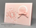
Shirl, this is just gorgeous! This card really reminds me of wildflowers on a misty morning, and I love that! Your color choices are gorgeous and the use of gold stickles highlights your flowers so beautifully. Your dsp peeking out on the bottom layer is really lovely too. I wish I had your gift for using gorgeous dsp and combining it with your beautiful stamped images! ~Karen.