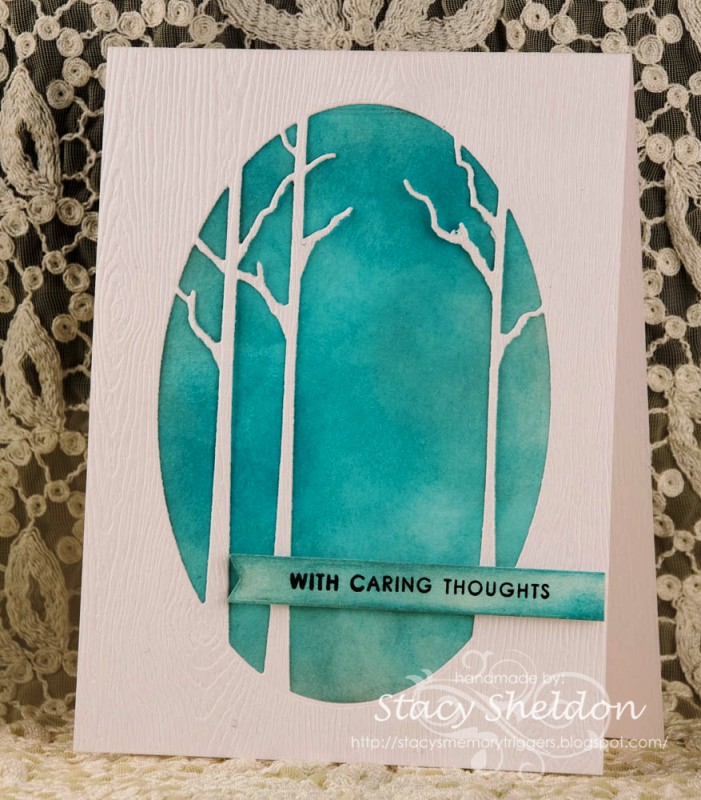
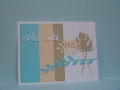
I seen so many cool crisp and clean designs in Heidko's gallery this morning but, this beauty really grabbed me. ( I need a couple of sympathy cards for (not family) but, still no one wants to make these right?) SO, changes were the die and to stamp the sentiment on a separate piece instead of the diecut center. The sequins were eliminated and I did add foam pop dots under the sentiment. I wanted the colors to be a little more somber than the cheerful blues of the broken china so I did smoosh in some iced spruce. ( the photo editing tweaked the colors trying to get the wood grain to show in the photo so, its really not this Blue in reality. Heidko, I hope you like this and enjoy your week, I did make a second one and there is a look at the inside on the blog. tfl!
Date: Sunday, March 26, 2017 GMT Views: 1341
Favorited:7
Registered: June 9, 2006 Location: Wauconda, IL Posts: 55667
Sun, Mar 26, 2017 @ 3:34 PM
What a beautiful card!! I looked through Heidko's whole gallery, but I don't remember seeing this one. That always amazes me how that happens. It must be because our eyes are just so focused on the one piece that grabbed us. I like what you created and your colors. Very pretty!!