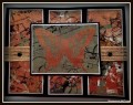
I didn't have exactly the ugliest color and not sure if it was because of my computer monitor that I could look at the color and one minute see a shade of green and the next minute a shade of brown. So I took colors that were close and did a torn paper collage. I embossed copper over that.
Date: Thursday, July 28, 2016 GMT Views: 630
Favorited:3
Registered: July 11, 2016 Location: I have dual citizenship to both USA and Canada. Posts: 123
Thu, Jul 28, 2016 @ 10:23 PM
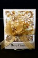
I really like the colors you used. That uggliest color looks more like a khaki to me. Even on the pantone site it looks like khaki. Thus the rust colors look so nice next to it.