Splitcoast Dirty Dozen Creative Crew SU Design Team Alumni
Registered: May 18, 2004 Location: Southwest Michigan Posts: 37094
Tue, Dec 29, 2015 @ 12:09 PM
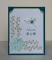
I like the open look of the flowers against that scribbly background, and the ferns peeking out. Also, love those clear dew drops - they look like water droplets.
------------------------------ Claudia Splitcoast Fan Club Member
Beautiful card! I think I prefer this one over the other, because it lets you see the flowers better! I really like that stamp, as a BG for the flowers and ferns!
Registered: June 29, 2004 Location: Sugar Land. Texas Posts: 79659
Tue, Dec 29, 2015 @ 3:39 PM
A great stamp combination with this great color combination.
------------------------------ LizThe joy of the LORD is my strength.Right Brain Madness --My blogProud member of the redDivasKSS certified multi-step stamperFan Club member since 2004