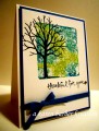
Karen chose the colors, lost lagoon, island indigo and pear pizzazz, with dessert of embossing. I don't have lost lagoon and only have island indigo and pear pizzazz markers. I decided to color with the markers on a piece of acetate, then misted lightly with water and used that as my stamp pad. I thought the lighter areas of the island indigo worked for lost lagoon ink. The sentiment was inked with versamark and island indigo, stamped and embossed with clear ep. The piece was framed and placed on the white card base. This is for our GD, who turns 17 in January. Thanks for giving me to opportunity to guest design for the month of December.
Date: Monday, December 28, 2015 GMT Views: 1314
Favorited:6
Registered: September 7, 2007 Location: Miamisburg, OH Posts: 43243
Mon, Dec 28, 2015 @ 7:48 PM
Sue this is so soft and lovely, a wonderful interpretation of the colors in a very subdued tone! I love it!!! Thanks for guest designing - your work has been stellar!
Splitcoast Dirty Dozen Alumni Creative Crew SU Design Team Alumni
Registered: October 29, 2004 Location: Coos Bay, Oregon Posts: 24007
Mon, Dec 28, 2015 @ 10:50 PM
Sue, I would never have guessed that you had not used 2 colors of green. Your watercolor technique is so beautiful and soft. I love how you framed your main image too. It was so fun seeing all your cards this month on CC challenges as one of the Guest Designers. TFS my friend.