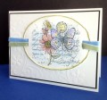
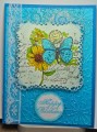
I colored the main features with distress inks, then watercolored around the images. Later I intensified the butterfly & flower colors with distress markers, and added white gel pen details.
Date: Friday, October 30, 2015 GMT Views: 5054
Favorited:29
Splitcoast Dirty Dozen Alumni Proud Fan Club Member Splitcoast Challenge Hostess Teapot Tuesday TEAm
Registered: April 18, 2011 Location: Melbourne, Aus Posts: 51844
Fri, Oct 30, 2015 @ 1:40 AM
Cindy this is so beautiful. Your colouring and choice of colours are gorgeous and the setting you created with the diecut layer completes a perfect picture. Pinned and faved.
------------------------------ Susie
Please don't take your organs to heaven - heaven knows we need them here.
Registered: March 20, 2008 Location: Hamilton, Ontario Canada Posts: 615
Fri, Oct 30, 2015 @ 5:01 AM
That is one gorgeous frame, perfect!!! The fact you've kept it white on white with the base of the card really makes the main image pop, the colors really stand out. What a wonderful job coloring with all of those various coloring tools, that layering of one on top of the other really works well. This was a favorite SU stamp set, you've used it in such a neat way, love it! Favorited...
Splitcoast Dirty Dozen Alumni SCS Gallery Moderator Splitcoast Challenge Hostess Teapot Tuesday TEAm
Registered: July 27, 2007 Location: Dublin, Ireland Posts: 131550
Fri, Oct 30, 2015 @ 7:01 AM
You've turned that old stamp into something fresh and wonderful. It has such a light, airy, summery feel, a real treat on a damp, cold grey day here. I too love the white gel pen details on the butterfly.