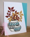
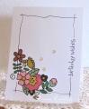
This has to be one of my favorite stamps. The pots are on vanilla so that they are the right color for the clay and so that there is contrast. Just a touch of color to pop.
Splitcoast Dirty Dozen Creative Crew SU Design Team Alumni
Registered: January 7, 2007 Location: Southern California Posts: 42877
Sat, Oct 03, 2015 @ 9:11 AM
This is really beautiful Diane. I love your pots with just the turquoise markings. The die cut branches spilling out of the pots are perfect touches. Thank you for the strong and peaceful imagery for today's challenge.
------------------------------ Kathy Stamp n Sip with me