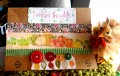
This is for Color Challenge 548. I got some form of every color in there, yay. That rose BG is actually an IO Cover A Card Stamp, stamped on WW with Versafine Onyx, then sprayed with Red Lead Artisan Ink in Fern Frond. I say this because it came out looking like DSP, which I thought was cool.
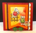
Dessert was leaves - well, there are leaves in my focal image and a leaf sequin, so I'd say I am covered.
AndÂ… notice no tilting of focal image? See? I can be versatile! !
TFL!
Date: Wednesday, September 16, 2015 GMT Views: 1320
Favorited:3
Splitcoast Dirty Dozen Alumni SCS Gallery Moderator Splitcoast Challenge Hostess Teapot Tuesday TEAm
Registered: July 27, 2007 Location: Dublin, Ireland Posts: 132004
Wed, Sep 16, 2015 @ 8:23 AM
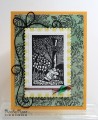
That woodblock nostalgic image panel just brings back so many memories of books read in my grandmother's house. The background suits it perfectly with the soft vintage look. What a fab corner die, too.
Registered: February 5, 2007 Location: St. Louis, MO Posts: 92631
Wed, Sep 16, 2015 @ 5:31 PM
Stunning card with the image that looks like a woodcut illustration from an old book. The rose strewn DP that you created is the PERFECT as a backdrop to the image panel.
Registered: August 15, 2007 Location: Twin Cities MN Posts: 50705
Thu, Sep 17, 2015 @ 12:20 PM
This is BEAUTIFUL!! I could easily see this hanging on the wall (it would work in my living room-ha) or on the cover an arty book. Love the woodblock image and the way you framed it perfectly (even without tilting yes, you can do it!) . Your homemade dp is fab (I see you got some RL artisan inks) and I am in love with that corner flourish die. Great way to work in the dk red color , too with just a bit of twine...brilliant!


 !
!