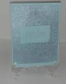
The hardest thing about this card was listing the numerous colors of inks I used and getting a photo that didn't look like mush. I masked a little edge around my card then smeared most of the colors of TH distress inks that i own over the card in somewhat of a sunset design. Made a little horizon line with the edge of the black soot ink. I don't have any little ink spots - this would have been super easy if I had those. Stamped my image and then stamped a lighter version behind it. Ran the blue ink pad over the white edges of the card, and added a little white and gold gel pen. The direct to paper technique always makes me think of these silhouette scene cards. TFL, Francie
Date: Monday, November 10, 2014 GMT Views: 1906
Favorited:4
Registered: August 15, 2007 Location: Twin Cities MN Posts: 50714
Mon, Nov 10, 2014 @ 3:25 PM
Very pretty and I like how you used the black soot horizon for your trees..and the trees are great the way you did a lighter stamping of them in the bg. Lovely card Francie!
Registered: January 8, 2011 Location: Sydney, Australia Posts: 40416
Mon, Nov 10, 2014 @ 5:35 PM
Even if I tried I'm sure I could not achieve such a scene as this using the DTP technique - wow, Francie - this is stunning - so vibrant and beautiful!!!
------------------------------ Sue
Fan Club Member QFTD143 FS420
Registered: March 31, 2008 Location: Eastlake, OH Posts: 22598
Mon, Nov 10, 2014 @ 8:23 PM
I have to agree with Sue, Francie! Direct to paper didn't work like this for me at all. What a gorgeous sunset and what made it so beautiful besides your fabulous colors is the highlighting you do. How you drew a horizon with an ink pad is beyond me! Absolutely beautiful!