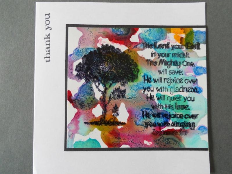
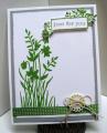
An experiement, inspired by a card I saw on Alie Hoogenboezem-de Vries' blog. http://aliehoogenboezem-devries-atc.blogspot.ca/ I don't know if she is on splitcoast.......was connected to her blog through some Dutch crafter's blogs. I used glossy Dollar store photo paper and dropped Ranger alcohol inks in several colours on the paper and when set a bit, tilted the paper and let the colours run. I was not satisfied, so I added some more drops, mostly aqua. this morning when it was dry, I stamped the scripture with Stazon Black ink, but it did not stamp very well, so then I tried the archival ink. It worked well, but on the glossy paper, my stamp shifted a bit. I did not want to discard this because I really like the bg, so I went ahead and stamped the tree with the archival ink too. Added a small sentiment on the top left.
Date: Tuesday, October 15, 2013 GMT Views: 1114
Favorited:2
Registered: October 12, 2007 Location: Arizona Posts: 70592
Wed, Oct 16, 2013 @ 11:22 AM
Awesome background effect! I like the black against the bright colors. Good for you trying things and using the results. Nice card for the tree challenge. TFS