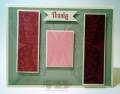
This color combination at first threw me. But I love the end result. At first I was going to bury the Sahara Sand, but I then thought it might look better to really let it shine. So I chose to do the spotlight technique with the little pop of color!
I love the end result. I wanted the panels to not be the same size, not sure if I achieved that, but I was fun to put together.
I'm not sure if you can see the detail under the saying. I used the Swallowtail stamp in Versamark for a little texture to my greeting banner.
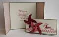
Hope you enjoy it!
Here's the original challenge:
CCREW0213DF, CreativeCrew, SUO or SUM -- DSP/Color Focus: I'm not focusing on DSP this month, instead we're going with a good old fashioned color combo, Raspberry Ripple, Primrose Petals, Pretty in Pink, Very Vanilla, & Sahara Sand! (Bet that threw you off, you were probably expecting a brown weren't you?)
Date: Tuesday, January 29, 2013 GMT Views: 696
Favorited:8