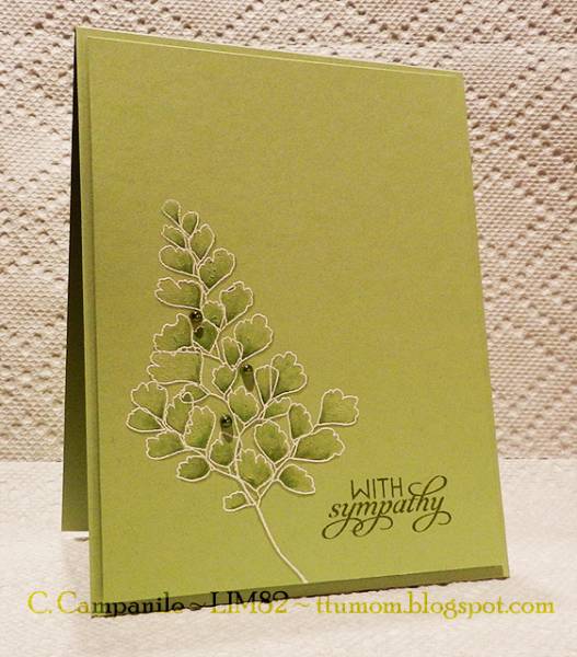
This card was made for the Less Is More challenge on Blogspot.
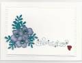
The idea to use white embossing powder on colored cards stock, then color in the image with darker colors in the same family came from a card I saw on Pinterest. Unfortunately I didn't pin it so I can't credit the person for the technique. :(
There is a better picture of the card on my blog; I took the one above last night just before bedtime, and was too tired to pull out the photo lights and blanket. I redid the photo after seeing how dark this one looks. That is Certainly Celery C/S and it looks like old olive in this picture. LOL
Registered: December 31, 2003 Location: Maryland Posts: 7008
Fri, Aug 31, 2012 @ 8:59 AM
This is so pretty! Some sympathy cards I've seen are just too much color, too much stuff. This is such a calm, soothing looking card - just what I'd want to receive at a difficult time.