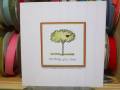
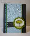
I jokingly told a friend the other night that combining a sketch challenge and a color challenge created 95% of the card for you. This card made me eat those words a bit. I used the colors from the colourQ challenge and paired them with the weekly sketch challenge on Splitcoast. I took me a bit to figure out where to use each color and what elements to add in, but I finally managed to get something that I liked. What do you think? I am not the best at coloring, so I'm trying to work on it a bit. Just like I don't like things touching, I also don't like my coloring to go outside of the lines. That makes watercoloring difficult, but I'm trying...
Stamps: Easy Events
Ink: Lucky Limeade, Basic Gray, Tempting Turquoise, Bashful Blue, Staz On
Paper: Lucky Limeade, Basic Gray, Tempting Turquoise, Bashful Blue, watercolor paper
Accessories: Basic Pearls, Bright brads
Tools: Big Shot, various embossing folders, scallop circle punch, circle punch, scallop trim border punch, aquapainter
Date: Wednesday, August 3, 2011 GMT Views: 3040
Favorited:35
Registered: June 25, 2007 Location: Hilo, Hawaii Posts: 28631
Wed, Aug 03, 2011 @ 4:10 PM
What a darling card! I had to chuckle about your coloring issues. It sounded like you were describing ME! I think you did a beautiful job with the coloring, and the colors you used and where you used them. I'm so inspired by your card, I hope you don't mind if I CASE it. I just love how you used the embossing folder. TFS
Minglerville Blabber Creative Crew SU Design Team Alumni
Registered: August 14, 2004 Location: Posts: 98098
Wed, Aug 03, 2011 @ 5:30 PM
This is lovely!
------------------------------ Debra the Debrameister Nagigator Mingler Gallery My Blog: Yellow and Blue SU Creative Crew Design Team Member-May-August 2011