Registered: April 20, 2005 Location: The only Eaton Rapids on the Earth, Michigan Posts: 57568
Thu, Nov 17, 2005 @ 5:20 AM
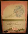
Boy, this card didn't look this dark on my computer. It really IS night of navy and not black on the background. The silver doesn't look silver to me either. Does anyone have suggestions on obtaining accurate color when taking pictures? I've noticed the distortion of color on some of my other cards, too.
Registered: August 28, 2005 Location: Rhode Island Posts: 32
Thu, Nov 17, 2005 @ 9:04 AM
Are you using a flash? Sometimes in your photoshop software you can add a flash to the image and that will help.
I actually liked it! The card has a vintage look to it and caught my eye right away! I thought you used black and gold or bronze with it and distressed the paper with tea!
Registered: August 24, 2004 Location: Wishing I was on the Beach, but living in MN Posts: 105
Thu, Nov 17, 2005 @ 8:54 PM
This is one of favorite holiday sets. You did a great job. I have used Frosty many times in my workshops and never thought of placing the greeting on Frosty's tummy. It awesome to see a new twist on soemthing I like so much. TFS
Registered: August 24, 2004 Location: Wishing I was on the Beach, but living in MN Posts: 105
Thu, Nov 17, 2005 @ 8:55 PM
This is one of favorite holiday sets. You did a great job. I have used Frosty many times in my workshops and never thought of placing the greeting on Frosty's tummy. It awesome to see a new twist on soemthing I like so much. TFS