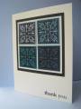
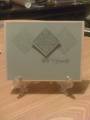
I am in a mood today to use the soon-to-be-retired SU colors. This card features Bordering Blue, which looks very gray -- and that's okay by me, I like grays. But....when I tried to match up a companion color for this card, I had a really hard time. I didn't want to overpower the blue, but I didn't want to use a bright color either. I needed a soft tone. Sahara Sand fit the bill for this Anniversary card, which I wanted to keep muted and understated.
Registered: April 3, 2007 Location: In a state of oblivion.... Posts: 14120
Fri, Apr 23, 2010 @ 2:41 PM
I like the muted tones - nicely done!
------------------------------ Heather ...... My Gallery You cannot do a kindness too soon, for you never know how soon it will be too late." Ralph Waldo Emerson Founding Member of the Punchkateerz - "You don't have to be crazy to be one of us, but it sure helps."
Registered: April 18, 2009 Location: Boston suburbs, MA Posts: 14060
Wed, Apr 28, 2010 @ 10:52 AM
Gorgeous, Colleen! You really nailed "muted and understated", plus SOPHISTICATED, with this beauty. So very nicely done
------------------------------ ~ Emily ~ My BLOG
My kids are on SCS: ponyluvingirl (age 14) and Legoboy (age 10)
I'm a Punchkateer! ~ I design for DeNami Design Rubber Stamps