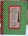
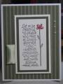
When I saw the colors in this comforter set, I immediately remembered a pad of K & Company DP that I had bought some time ago. I did the main image two different ways -- the first was sponged around the outside, but I think I like the sponging over the sentiment instead.
Date: Saturday, January 23, 2010 GMT Views: 1145
Favorited:12
Registered: April 6, 2005 Location: Stuarts Draft, Virginia Posts: 14401
Sat, Jan 23, 2010 @ 7:50 AM
Very pretty, Lois...will have to try sponging over the sentiment sometime...great look!
------------------------------
Wanda Cullen ~ Dirty Dozen Alumni, On design team for Papertrey Ink, Designer for Color Throwdown and Fusion Card Challenges Cullen-ary Creations[/URL]...my blogHERE'S MY GALLERY[/URL]
Splitcoast Dirty Dozen Alumni SCS Gallery Moderator Splitcoast Challenge Hostess Teapot Tuesday TEAm
Registered: July 27, 2007 Location: Dublin, Ireland Posts: 131702
Sat, Jan 23, 2010 @ 8:16 AM
I like the sponging over the sentiment - it highlights it nicely, while the warm colour of the flower is strong enough to balance it with the sponged text. Those warm colours are so lovely.
Registered: April 22, 2006 Location: SCS in NC Posts: 20914
Sat, Jan 23, 2010 @ 10:59 AM
I have always really liked these Sidekick Sayings. I have to get mine out.. I rarely use a sentiment. This is very pretty and you picked the perfect paper.. I like the corners punched like that...
------------------------------ Dawn B. Anything is possible when you open your heart.... My BLOG
Registered: August 21, 2007 Location: Wayland MA Posts: 105159
Sat, Jan 23, 2010 @ 10:59 AM
What lovely colors together, Lois!! I really like this layout, and the way you colored the sentiment!!
------------------------------ Anne HarmonFS154, QFTD58, PROUD FAN CLUB MEMBER (photo of our Great Granddaughter Elise, just 6 months old) and me, even older.