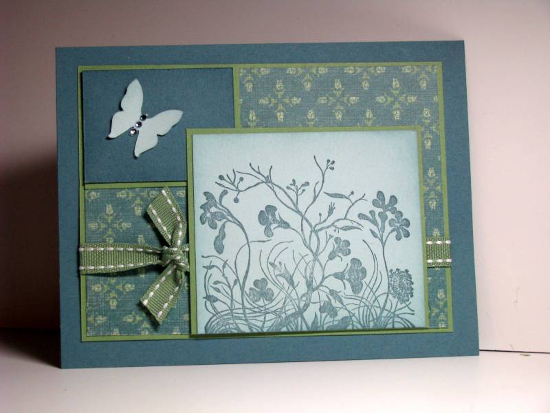
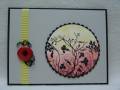
I knew I wanted a "misty" look to this card as it is destined to be a sympathy card. So I pulled out Soft Sky and Porcelain Prints dsp and went from there. I found the small square at the top of the sketch difficult to work with. I'm still not sure that my card has any "balance" because of that square - but I'm happy with it.
Kim
Set 4 for my 2010 goal of using all of my SU sets.
Date: Wednesday, January 6, 2010 GMT Views: 1995
Favorited:23
Registered: April 6, 2005 Location: Stuarts Draft, Virginia Posts: 14401
Wed, Jan 06, 2010 @ 7:11 AM
Gorgeous DP...great job with the SC!!
------------------------------
Wanda Cullen ~ Dirty Dozen Alumni, On design team for Papertrey Ink, Designer for Color Throwdown and Fusion Card Challenges Cullen-ary Creations[/URL]...my blogHERE'S MY GALLERY[/URL]
Registered: August 10, 2008 Location: Texas Posts: 326
Wed, Jan 06, 2010 @ 7:20 AM
Beautiful card, looks wonderfully balanced to me. These are my favorite In Color selections. I will definitely be CASing your interpretation of the card sketch. TFS!