Registered: August 12, 2004 Location: Camel in Kuwait Posts: 4122
Sun, Aug 21, 2005 @ 6:16 AM
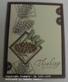
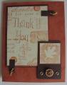
Is the paper behind the raised pinecone the same color as the gingham?? I can't tell in the picture..
I think I might have put the 1/2 circle from the left onto the right with the other 2.. For some reason, it just looks all alone out there and it almost, IMO, makes that left side a little too busy.
Then again, what do I know.. I am just an amateur.
Registered: January 29, 2005 Location: Posts: 26450
Sun, Aug 21, 2005 @ 6:26 AM
I like it, but I agree with the first post-er, the circle on the bottom left would look better with the others on the top right. The card is a little bottom heavy, because the greeting is down there too.
Registered: March 15, 2005 Location: Iowa Posts: 7287
Sun, Aug 21, 2005 @ 8:35 AM
I love it as I love this set. Something is a bit off but I am not sure what,,,, I love all the different elements, maybe they just need to be moved around a bit... perhaps when you stamp the pinecones on the bg, turn your stamp each time you stamp, you have them going the same direction, sometimes doing that helps the eye follow better, gives it a flow. I really struggle sometimes with the direction of stamping especially if I am stamping something over and over like the pinecone. This card jumped out at me though because of all the elements and I wanted a closer look,,,
------------------------------ Sherlie..... aka Surelyyoustalktoo? Just living is not enough, one must have sunshine, freedom, and a little flower,and a few stamps, of course, www.splitcoaststampers.com/go/Sherlie
Registered: August 4, 2004 Location: Kingston, ON, Canada Posts: 1267
Sun, Aug 21, 2005 @ 9:26 AM
Very clever!!! I really like it!! Whenever I'm not sure about a card and I'm tempted to add more, I try to put it away and then I take another look at it the next day. I bet you'll definitely feel that way about this one. I love the clean line and your brads just make it pop. (Dont' change a thing!!)
Registered: February 21, 2005 Location: Central Washington Posts: 2087
Sun, Aug 21, 2005 @ 11:08 AM
I really like the card and how you colored in the one and added the ribbon to it. That centers the card. It is good the way it is! To improve it, I would agree that the botton circle would balance it out more placed with the other two. I would be proud to send it as is and the next one I would place the circles all together! TFS


 Love it as it is, don't change it.