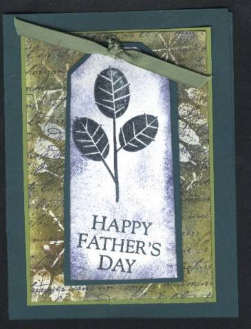
This is another versamark resist. Any constructive critisizm is appreciated as I am a new demo. this is only my second posting. I know "happy fathers day" is a bit crooked. I goofed! OOPS.
Date: Tuesday, May 10, 2005 GMT Views: 1139
Favorited:23
yes, I forgot to add clear embossing ink to my recipe. Sorry. I stamped with the 3 leaves (being careful not to ink the thankyou part) in versamark and put it on my white card stock that I had stamped the french script in Night of Navy on already. I did a few sparkles, embossed these with clear embossing powder and then used a sponge to color paper with old olive, night of navy and forest folliage. I mounted this on olive and forest folliage. I stamped the tag in forest and embossed with clear again. sponged night of navy ink on edges. layered on forest folliage. attached ribbon and put on my card with dimensionals. Sorry to leave that out too. OOPS.
------------------------------ My avtar is my son, Jayden, born Sept. 2001 My Gallery Visit my Blog
Registered: May 5, 2004 Location: Spokane, WA Posts: 8273
Tue, May 10, 2005 @ 4:23 PM
Your card is very nice. Actually your sentiment looks like it should be that way. I wouldn't have thought it to be crooked if you hadn't have said anything.
------------------------------ Sandy~
For I know the plans I have for you, declares the Lord, plans to prosper you and not to harm you, plans to give you hope and a future. Jeremiah 29:11
Registered: March 25, 2004 Location: New Bedford, Mass. Posts: 4934
Tue, May 10, 2005 @ 4:43 PM
I think you did a marvelous job! I think your card is beautiful, I cannot believe this is only your second posted card! I like the way the sentiment is crooked, it looks like you did that on purpose! I love your card just the way it is, colors and all! Just keep them coming!
Friends are like the walls of a house. Sometimes they hold you up, sometimes you lean on them. But sometimes, it's enough to know they're just standing by.
Registered: September 10, 2004 Location: Posts: 56
Fri, Jul 15, 2005 @ 9:43 AM
The card is great. But, if you think the sentiment looks bad, position the tag so that this sentiment is straight. A great way to cover any problem, make it look like it was on purpose!!