Splitcoaststampers.com - the world's #1 papercrafting community
You're currently viewing Splitcoaststampers as a GUEST. We pride ourselves on being great hosts, but guests have limited access to some of our incredible artwork, our lively forums and other super cool features of the site! You can join our incredible papercrafting community at NO COST. So what are you waiting for?
I finally ordered some Distress Oxide inks I had held back thinking I didn't need them
but watching a Tim Holtz video from Creativation 2018
it didn't take long to change my mind lol :p
it took me ages to work out what colours to buy first though:confused:
I am not a vintage or grunge crafter so the browns were not a priority
So in the end I ordered 4 ink pads with the view to build up my collection
gradually buying 3 or 4 at a time as money is tight and i have a massive wishlist! The 4 distress oxide ink pads I ordered were
Picked Raspberry, Broken China, Wilted Violet, Fossilised Amber
so my question to those of you with experience with these ink pads is...
1, do you have any tips or suggestions to get the most out of them
2, what colours have become your favourites I don't need them all do I?
3, what tutorials have helped you with using them
any advice would be appreciated
I've had a notification to say they are despatched
so looking forward to using them this weekend:lol:
__________________ The PapercraftessDoing what I love, Loving what I do My Blog
These inks are so fun and versatile! My advice? Play...a lot! Smoosh the pads on a craft map, spritz with water and start dipping your card stock for fun backgrounds. They blend beautifully, especially fun with stencils. But they also stamp great. One color that has become a go-to for me is Black Soot. Adds great depth to those smooshed backgrounds, but is wonderful for stamping sentiments, silhouette or outline images. Abandoned Coral and Broken China are two more of my favorites. Have fun!
What is your style? If it's more clean and simple, Jennifer McGuire has some nice videos. Just google "Jennifer McGuire Oxide" or do the same on youtube.
A few hints, most learned from an Oxide class:
- Unlike regular Distress inks, when different Oxide colors are layered on top of each other they won't make brown/mud - *if* you allow each layer to dry somewhat - they doesn't have to be bone dry. You can use a heat tool. Oxides are somewhat like opaque paint.
- If doing a technique where you remove some ink - like swiping a baby wipe through a stencil - put quite a few thin layers of ink down first. Then add more. : ) They can be different colors if you want. Then when you wipe ink away you'll still have ink, not bare cardstock - unless you want that.
- (Added) Same as the above for blending. You want enough ink, so thin multiple layers is key. When you think you have enough? Add another layer. If you apply pink and then yellow to make orange where they overlap, you don't want to hit bare cardstock. And if you don't like it? Dry it and add more or a different color on top.
- And yes, what Becky said above. Try with a bit of separation between colors on your craft mat. When you smoosh, pat the cardstock down and pick it up. Let it dry somewhat before re-smooshing in order not to make mud. You can always add more, and even cover completely what you don't like. But patience (drying/heat tool) is a virtue.
- You can combine regular Distress with Oxides. Regular Distress is translucent so Oxides show through. In the class I took, we put regular Distress Walnut on top of some of the Oxide inks to give it a aged look. Some of us (me) used a tiny amount; others lots.
- Even though so many (too many) videos only show techniques with water, you don't need water. Oxides blend and stamp well, including with fairly detailed stamps and some sentiments.
- You can use a shimmer sprits, metallic watercolors, and other water based mediums with Oxides. They're friendly.
- Play.
Last edited by bjeans; 01-26-2018 at 07:58 AM..
Reason: Added the part that says "added."
I was going to point her in your direction, Beth! I have an email from you with tips hanging by my desk for those times I want to play! Your class experience has helped me lots! I see more oxides are coming soon! I only have the first twelve. I won't be getting them all, but what other ones do you recommend to add to those twelve? I am pretty sure I want picked raspberry. But not sure what other colors yet.
Some recommended colors to add to your list: Peacock Feathers, Spiced Marmalade (blends beautifully with the Picked Raspberry and Fossilized Amber you already have), and Abandoned Coral.
I was going to point her in your direction, Beth! I have an email from you with tips hanging by my desk for those times I want to play! Your class experience has helped me lots! I see more oxides are coming soon! I only have the first twelve. I won't be getting them all, but what other ones do you recommend to add to those twelve? I am pretty sure I want picked raspberry. But not sure what other colors yet.
: ) What color stories do you like? I looked at your gallery briefly but couldn't go further back than the holiday/seasonal palettes of Halloween/Thanksgiving/Christmas/Winter. Is there a setting? Mostly I'm on an iPad. (This newer 2 cards per line that look a little elongated isn't good.)
Would you want a more balanced ROYGBIV palette? Then fill in the blanks, or go heavier with warm or cool colors if that's your taste.
And if you have colors in regular Distress, playing with them along side of your Oxides - doesn't have to be separate swatch - may help.
Later today or tomorrow I'll look at my second set plus the new ones and meanwhile I agree with pbft that Black Soot is a must if you want a neutral that isn't a Tim brown. And Picked Raspberry is yummy.
Some recommended colors to add to your list: Peacock Feathers, Spiced Marmalade (blends beautifully with the Picked Raspberry and Fossilized Amber you already have), and Abandoned Coral.
I have spiced marmalade as it was in the first set of twelve. I like your other suggestions!
: ) What color stories do you like? I looked at your gallery briefly but couldn't go further back than the holiday/seasonal palettes of Halloween/Thanksgiving/Christmas/Winter. Is there a setting? Mostly I'm on an iPad. (This newer 2 cards per line that look a little elongated isn't good.)
Would you want a more balanced ROYGBIV palette? Then fill in the blanks, or go heavier with warm or cool colors if that's your taste.
And if you have colors in regular Distress, playing with them along side of your Oxides - doesn't have to be separate swatche may help.
Later today or tomorrow I'll look at my second set plus the new ones and meanwhile I agree with pbft that Black Soot is a must if you want a neutral that isn't a Tim brown. And Picked Raspberry is yummy.
I have black soot in the regular distress. Wasn't sure how regular and oxides would play together.
My tip is not to forget to actually stamp with them. They stamp really nicely!
You are so smart to mention this! I just discovered this past week that Distress oxide ink worked really well to stamp a sentiment. Ink stayed crisp and clear and didn�t fuzz out on the edges like regular distress ink.
I have black soot in the regular distress. Wasn't sure how regular and oxides would play together.
They play very nicely together for some looks, not others. A little bit like putting a transparent stain/wash (regular Distress) on top of opaque paint (Oxides). I think it's in the hints.
But if you want a color to pop against solid black you could put Oxides on black CS or against some Black Soot Oxide.
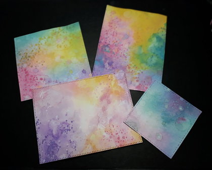
Well that was simply amazing, WHY DID I WAIT SO LONG??? I had a lovely time yesterday with my new inks I made some kinda rainbow bright backgrounds and found these inks to be so much easier than the original distress inks (I made mud with those) I used some little dots from a stamp on the timeless textures S U stamp set. I feel like I am on and adventure I just don't know where I am going but really enjoying the journey LOL A couple of questions though! what cardstock do you find works best with Distress Oxide inks? I have just used some cheep cardsock as I was practicing but it crinkled up a lot. I need to get the right paper/card I guess watercolour paper would just soak all the ink up?
another question... what comes first? the lovely background or the card plan
like what stamps etc you want to use to make the card, do you plan the card?
that yellow colour didn't seem that intense in real life the photo didn't upload totally true to colour but its very close. maybe its because I use a daylight lamp as it was very early morning when the pho was taken. please let me know what you think! i am at a loss what to do next with these samples I really like them so have to use them somehow, thanks for all your help so far I'm loving this SCS community xx
__________________ The PapercraftessDoing what I love, Loving what I do My Blog
Well that was simply amazing, WHY DID I WAIT SO LONG??? I had a lovely time yesterday with my new inks I made some kinda rainbow bright backgrounds and found these inks to be so much easier than the original distress inks (I made mud with those) I used some little dots from a stamp on the timeless textures S U stamp set. I feel like I am on and adventure I just don't know where I am going but really enjoying the journey LOL A couple of questions though! what cardstock do you find works best with Distress Oxide inks? I have just used some cheep cardsock as I was practicing but it crinkled up a lot. I need to get the right paper/card I guess watercolour paper would just soak all the ink up?
another question... what comes first? the lovely background or the card plan
like what stamps etc you want to use to make the card, do you plan the card?
that yellow colour didn't seem that intense in real life the photo didn't upload totally true to colour but its very close. maybe its because I use a daylight lamp as it was very early morning when the pho was taken. please let me know what you think! i am at a loss what to do next with these samples I really like them so have to use them somehow, thanks for all your help so far I'm loving this SCS community xx
Beautiful backgrounds!!! One of the new colors coming out is Squeezed Lemonade, and I am getting this one for sure.
Check out Jennifer McGuire video, it is awesome if you want some more ideas!!
I was going to point her in your direction, Beth! I have an email from you with tips hanging by my desk for those times I want to play! Your class experience has helped me lots! I see more oxides are coming soon! I only have the first twelve. I won't be getting them all, but what other ones do you recommend to add to those twelve? I am pretty sure I want picked raspberry. But not sure what other colors yet.
I dabbed the first two sets on CS in ROYGBIV groups.
- Candied Apple if I wanted a red or Picked Raspberry if I leaned more toward strong cooler pink with a hint of magenta undertone.
- Abandoned Coral absolutely.
- Wild Honey (brighter than Fossilized Amber, more yellow than Spiced Marmalade)
- Lucky Clover if I wanted more of a primary Crayola green
- Twisted Citron if into yellowed-limes
- Peacock Feathers if I wanted a greener blue-green than Broken China
- Salty Ocean if I wanted more of a primary bright blue
- Antique Linen for a more neutral neutral. : ) It's tannish.
- Black Soot unless you never work with black.
So that's 9 out of 12 but notice the "ifs" right?
I don't remember what's in Set 3 except for Lemonade and that's a must have. You could blend Lemonade and Spiced Marmalade together and end up with something like Wild Honey if you're trying to limit the number, but I love Wild Honey.
Beth
Last edited by bjeans; 01-28-2018 at 01:34 PM..
Reason: Chrome spacing!
My LSS doesn't have Set 3 yet but should soon. I'm not as must-have-crazed as I was with Set 1 or even Set 2, since with the exception of a light yellow (Squeezed Lemonade), Hickory Smoke and maybe (??) Tattered Rose, the first two sets are satisfying, and I don't use violets/purples much. Not that I'd say no to any of them!
Cindy at Starlit Studios is getting the new oxides in tomorrow. I believe she is offering 20% off for the whole new set and 10% off if you buy them individually. She is nice to deal with and ships fast. You do pay postage though.
Papercraftess, with backgrounds like that I usually start with the background and then see what it inspires. They make great die-cuts, and I think silhouette stamps and bold sentiments look good on them.
I use both watercolour paper and regular cardstock...I usually buy one about 260 GSM.
Personally I still think there's a place for the distress inks... sometimes I want my background to be a more neutral, soft background and I still make a lot of wrinkle free distress backgrounds with the original distress inks.
If you are into them, galaxy backgrounds. I prefer using the oxide colors with regular distress black soot, I think it gives you a blacker color while the oxide black soot greys over the colors. I use the exact colors you got. I just love how beautifully the oxide inks blend. Love your backgrounds.
I ordered another 4 Distress Oxide ink pads this weekAbandoned Coral, Cracked Pistachio, Peeled Paint, Antique Linen,
the first 2 are fabulous with my other colours,
kind of all things bright and beautiful lol:p
I needed a green for leaves etc so got the Peeled paint
but will be getting the Twisted Citron next time to mix with it
I got the Antique Linen simply to use to mix with my vibrant colours
to give a soft pastel effect, I am so pleased with how that worked.
especially with Abandoned Coral it gives some lovely fleshy peach colours
I love it when a plan actually works :lol:
I couldn't order the shaded lilac at the time as it wasnt in stock yet
but now gonna choose another 3 to buy together with it
think I need a regular (not turquoisey) blue and perhaps an orange tone?
any suggestions bearing in mind the colours i already have are...
Picked raspberry, Broken China, Wilted Violet, Fossilised Amber,
Abandoned Coral, Cracked Pistachio, Peeled Paint, Antique Linen,
I had a bright idea of attaching the foam ink blending pads
to the bottom of my ink pads so I had one for each colour
trouble is now the ink pads don't stack (silly me)!
how do you store your ink pads?
__________________ The PapercraftessDoing what I love, Loving what I do My Blog