Splitcoaststampers.com - the world's #1 papercrafting community
You're currently viewing Splitcoaststampers as a GUEST. We pride ourselves on being great hosts, but guests have limited access to some of our incredible artwork, our lively forums and other super cool features of the site! You can join our incredible papercrafting community at NO COST. So what are you waiting for?
Thanks V! I had the same conclusion - works with OMS but more vibrant with water.
I sooooooo love your pretty color charts......... Making charts of marker and pencil and inkpad colors is my favorite thing to do when I'm procrasting. Plus it's nice to see all the colors 'for real' rather than website samples - I am adding to my collection little by little.
I use Prismacolor pencils and they have their own blender pencil or you can use a brush or qtip with Turpenoid. They have oil in them and I think blend the best. They also have the best selection of colors. I agree that if you don't have a real sharp point, it also helps the breakage. Good Luck!
Jumping right in here. I love, love, love pencils and Dick Blick frequently gets me in trouble. I got the 72 piece Inktense tin for Valentine's day from the hubs. The man knows the way to this girls heart!
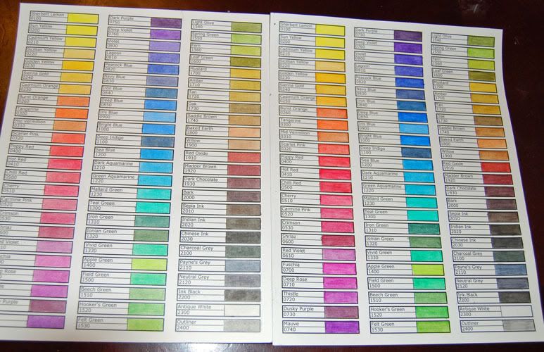
I will say that while water brings out the best in them, you can get quite a bit of vibrancy from OMS. Take a look at my color charts. I knew I'd be using both blending mediums, so I made one for each to grab and go.
The one on the left is blended with Zest-It (OMS) and the one on the right with water (H2O). You can really see the difference in the darkest colors. Either way, the colors are just gorgeous!
V
WoW! Love your colour chart ' v' looks great! l think i might make up one of my own for my inktenses and prisma's, tfs!
That's great to know. Looks like the OMS makes the colors a little less vibrant which is great because sometimes you don't want the colors to be so deep. So now...I know I can use them more often for more projects. By the way, what a husband you have!! I'd say he's a keeper. Mine's not bad either......he's going to help me set up one of our bedrooms as a craft room. Guess I'll let him stick around for ANOTHER 40 years. He'll be looking a little funky since that would make him 107 decrepid years old - lol - not pretty!
WoW! Love your colour chart ' v' looks great! l think i might make up one of my own for my inktenses and prisma's, tfs!
Here's my charts for my Prismacolors and for the new Inktense. I love using them. Not only do I have a quick visual of how the color is going to look when I'm done, it makes it super easy to match my colors to my patterned papers. That way I know my images are going to match my papers before I even get started.
That is great --I have a color chart for my Copics but never thought to do it for my pencils! Thanks for sharing
I have two for my Prismacolors, one on each type of paper I use most for coloring. So I have one colored on Gina K's Pure Lux base weight and one on PTI's Rustic White. They look different on the two papers since the Pure Lux is super smooth and the Rustic White has a more coarse finish. The PTI gives me bolder, more intense colors as even coloring lightly leaves a lot of pigment on the coarser finish. It also takes more OMS to blend because it wants to absorb the solvent.
I stopped in an art store here in Phoenix and bought 10 Pablo Caran De Arch pencils and 4 ProMarkers! Yay! I don't plan on getting anymore of either but I just wanted to try them out for comparison
i FINALLY got a chance to check out my dick blick order that arrived monday - it had some pencils from a number of different sources just to try out. i got some derwent coloursoft, caran d'ache pablo and luminance and some polychromos. i only made a color chart with them but the feel is not tremendously different. i think i DO wish i could get a full set of the polychromos but i definitely don't see what makes the luminance 3.84 each....
here is a little cutie i just finished coloring up - she will be making an appearance on my blog tomorrow!
Michell...DO Tell...Do Tell w/regards to the Caran D'Ache esp...
cerridwen3301...OMG...that stamp has been sold out at All that Scraps...I have been waiting for it to come in...Your coloring is FANTASTIC!!! Did you use OMS???
cerridwen3301...OMG...that stamp has been sold out at All that Scraps...I have been waiting for it to come in...Your coloring is FANTASTIC!!! Did you use OMS???
Valerie[/QUOTE]
thanks so much! no i don't use OMS - i find my coloring looks awful when i do - maybe i just don't do it right or something....
i just bought some from a brand called Cra-Z-Art, at walmart,
72 for $5.47.
they are awesome pencils! i havent tried blending with babyoil or gamasol yet but they color very smoothly and i did blend a bit with just my finger, nice!
they have cool colors in the box too like: bubbly blue, cappucino, orange crush, and persimmon.
they were in the kids art supply section.
__________________ HollyHock, she who runs in scalloped circles.........
What a great deal. I'd be interested to hear how they do when you use baby oil or gamsol. I already have so many pencils I don't even know why I'm asking this question. Oh yes I do.......I'm nuts - lol.
Michell...DO Tell...Do Tell w/regards to the Caran D'Ache esp...
cerridwen3301...OMG...that stamp has been sold out at All that Scraps...I have been waiting for it to come in...Your coloring is FANTASTIC!!! Did you use OMS???
Valerie
I used them last night and I can't tell any difference in them and my Derwent Coloursoft pencils. I won't be buying any more of them.
I got a set of the Dick Blick colored pencils. I like most of them, but there are several that seem to have no pigment and too much wax: light green, light violet, and pink. I got an extra of the light violet, and pink and none of them has any pigment.
Did I get a bad batch or are yours like this? The other colors that I have used seem fine, although I have not used all of them. The darker colors are much better.
I only have a couple of colors from the Blick line, and they are fine... If it seems to be defective, I would write to their customer service and let them know you're unhappy - they really stand behind their products and I'm sure they would be willing to work with you.
You were so right, Dini. Their customer service is wonderful.
I just got off the phone with Shannon. I was sent to product information where I talked to a gentlemen and he sent me back to Shannon. He asked me what I would like and I told him I would like the pencils replaced with another kind. He thought that was fair and sent me back to customer service with product numbers for new pencils. Shannon was so nice. She told me if I found any more that were bad to let her know right away.
V, thank you for the color chart. It was exactly what I needed!
I asked some of these questions on another thread, so if you are reading them for a second time, I apologize. I thought this was a good place to ask again, since so many of you are so skilled with colored pencils.
My questions:
Are there any inktense colored pencils that would work for skin colors of all kinds? Are they just too intense for skin colors?
If you don't use inktense for skin tones, what do you use? Please list brands and color names that you like.
Do you mix mediums.... for example color faces with Copics and the rest of the picture with colored pencils? If you do mix is there an order you need to follow so as not to mess up the previous coloring? Copics first and then color pencil or pencil first and then Copics?
I purchased the 36 set of Inktense and plan to add some additional colors (IMO the 36 set has a rather odd assortment of colors.... lots of blues, greens and browns, and almost no yellows, oranges, or pinks). Are there colors in the 72 set that are not in the 36 set that you would suggest buying?
Do you have any experience with Lyra skintone pencil sets, and if so what do you think of them?
I just looked at my set of 72 inktense and don't really see what I would call skin tones, Inktense are known for their intensity but you could probably water one down a lot before applying to your image and it would work for skin.
I've used my Colorsoft pencils over markers, which smoothed out the speckling of a copic marker. You can use markers over pencils depending on the marker and pencil color. A darker marker covers a lighter pencil and you cant really see the pencil. A darker pencil can be colored over by a lighter marker which can be cool for certain applications.
I don't necessarily follow any rules, I try different things and if I like it, I go with it. I probably have helped you much, sorry!
I'll try to answer your questions as best I can. First and foremost, I will say that color is highly individual. Dina gets amazing results and uses techniques that while similar to mine are also quite different. That can be said for all of us. So while my answers are good, they're not the end all/be all. Dina has some excellent pencil comparisons on her blog, so I'd suggest checking those out when you have a minute.
Quote:
Originally Posted by annie*
My questions:
Are there any inktense colored pencils that would work for skin colors of all kinds? Are they just too intense for skin colors?
If you don't use inktense for skin tones, what do you use? Please list brands and color names that you like.
I've only had my Inktense a few weeks, so I haven't even begun to give them a proper workout. That and the fact that 95% of my coloring is done on Dustin Pike's Doodle Dragon Studios images means I have yet to try them on faces. There are some browns that if the were used very lightly would make for some good skin tones. I'd have to experiment with them to see which I would prefer, however.
For skin tones, I primarily use my Prismacolor pencils. I use 1093 Seashell Pink for an overall base and then fill in with PC1092 - Nectar for shading. Poppy red (I don't have the color # with me on that one) is good for pinking up the cheeks.
Quote:
Do you mix mediums.... for example color faces with Copics and the rest of the picture with colored pencils?
I can honestly say I don't own a single Copic. I'm a colored pencil girl all the way. I do mix water color and regular however without any regard to what I use first. If I want my color to remain true without blending, I reach for the Inktense first. Once dry, these don't blend into anything that is layered on top of them.
Quote:
I purchased the 36 set of Inktense and plan to add some additional colors (IMO the 36 set has a rather odd assortment of colors.... lots of blues, greens and browns, and almost no yellows, oranges, or pinks). Are there colors in the 72 set that are not in the 36 set that you would suggest buying?
All of them? Seriously on this one, it's more of a coloring preference. I don't use purples hardly ever, so if I'd bought mine in less than the full set, those would have been my last to pick up.
Quote:
Do you have any experience with Lyra skintone pencil sets, and if so what do you think of them?
I have not tried these, although I have looked at them a few times. I haven't tried them because I have comparable colors in my Prismacolor set.
That's me. The others will chime in as they check the forum.
Wow, V! You have been very helpful with your responses. Thank you for the information that you have provided.
I am in that painful learning stage right now and I keep feeling like I am just a poor watercolorer (not sure that is a word). My family continues to cheer me on which is probably a good thing, since I really don't want to give up. I keep thinking of going back to my Copics because they are easier.... but probably only because I have already gone through the painful learning process with them.
I love mixing media... markers and pencils, markers and watercolors, etc. When I'm watercoloring, I have a lot to choose from too - Twinkling H20s, pencils (watercolor, Graphitint and Inktense), reinkers, Shimmerz.... and then sometimes I'll 'scrumble' over the dried piece with a regular colored pencil (grey or sepia) or add highlights with a gel pen.
I only have about 16 Inktense pencils so I'm not much help there. I have the full set of Derwent Watercolor pencils and there isn't really a good flesh tone there either. I usually use the Pale Vermillion but water it down a bit. I wonder about the Inktense Mid Vermillion - if you scribbled a little on a scrap piece of paper and went at it with a pretty wet brush, how it would do as a flesh tone. I don't have that one though... maybe V could try it...? With any of the Inktense pencils too, if you sharpen them well and just 'tickle' the paper with them, you can achieve very subtle tones. Don't be afraid to play and experiment.
I only have about 16 Inktense pencils so I'm not much help there. I have the full set of Derwent Watercolor pencils and there isn't really a good flesh tone there either. I usually use the Pale Vermillion but water it down a bit. I wonder about the Inktense Mid Vermillion - if you scribbled a little on a scrap piece of paper and went at it with a pretty wet brush, how it would do as a flesh tone. I don't have that one though... maybe V could try it...? With any of the Inktense pencils too, if you sharpen them well and just 'tickle' the paper with them, you can achieve very subtle tones. Don't be afraid to play and experiment.
You can also touch a wet brush to the tip of the pencil and get just a touch of pigment that way. This works with any water soluable pencil.
You can also touch a wet brush to the tip of the pencil and get just a touch of pigment that way. This works with any water soluble pencil.
I do that most of the time... but I've found with that method that the more times I 'hit' the pencil with water the more intense the pigment becomes each time... when you have the scribble on another sheet of paper, you can pull the pigment out with your brush and see how much you have on your brush before you return to your project. Just something I was playing with the other day.
With watercoloring too, I always keep either a paper towel or a scrap piece of cardstock or watercolor paper nearby so I can tap off extra water and/or pigment.
I am going to throw in a question too. Which is better to get a basic set of Inktense or save up for a full set?
Oh, that's a tough one. I have the full set and absolutely love it. If you have a local art store that carries them in open stock (or you're doing an order from Blick), though, it's good to pick up a couple to make sure you like them before you spring for an entire set.
I bought a 12 pack of Inktense from Michael's and used a 40% off coupon. Tried them, loved them, and then went to DickBlick.Com and ordered colors I liked.
Dini,
Thanks so much for your great information! I am going to need to spend a little time reading and studying your information. You are all very helpful and I appreciate you for taking the time to help.
Thank you for the help. I guess I will start with a basic set then buy individually. That will probably work best for me since I like to build my collections slowly.
I just received my Lyra Skintones colored pencils from Dick Blick. At last, I think I can make skin look more realistic than the mix of prismas I've been using. Has anyone else tried them?