Splitcoaststampers.com - the world's #1 papercrafting community
You're currently viewing Splitcoaststampers as a GUEST. We pride ourselves on being great hosts, but guests have limited access to some of our incredible artwork, our lively forums and other super cool features of the site! You can join our incredible papercrafting community at NO COST. So what are you waiting for?
I just use very light shades of grey or tan, either in pencils or copics, and shade the bottoms of the bellies, under the head, and other areas along the edges. Here's some sheep I did using prismacolors. Think of it more as coloring shadows, than coloring a white creature.
__________________ aka Sue. Or Sue-odd.
No blog for me. My gallery chronicles my card-making successes and mishaps.
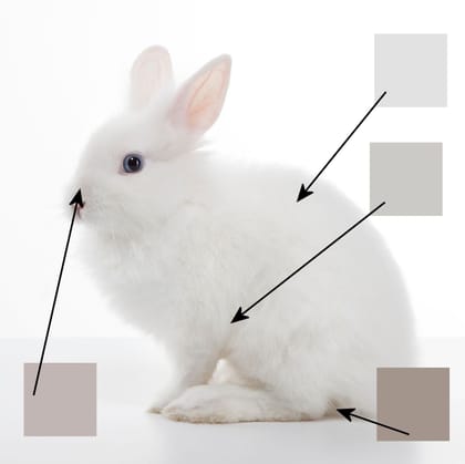
Something that helps me is using a color picker to really pinpoint the colors in a reference photo - so here's a white bunny... I used the eyedropper tool in my photo editor to find the colors of specific pixel areas in the photo, and this follows Elaine's theory of warm greys for living things.
Something that helps me is using a color picker to really pinpoint the colors in a reference photo - so here's a white bunny... I used the eyedropper tool in my photo editor to find the colors of specific pixel areas in the photo, and this follows Elaine's theory of warm greys for living things.
what a great explanation and a great tip on how to do it!
I learned from Sandy Allnock on YouTube, she has incredible coloring tutorials and has a few where she teaches about coloring white space, it really helped me!
I don'[t buy any card magazines any longer but I've kept all my old ones and they are such fun to look at every so often or to discover one (as I just did now) that has an article you didn't read because you weren't interested but not seems to apply to you. Anyway, found the article I needed in the Nov. 2011 Cardmaker magazine. It's an interesting article regarding white and copics but basically it says to use warm tones on live subjects and if the object is cool to the touch like ice or snow, one uses cool tones.
I use warm greys for living things (except flowers), fur or some clothes, cool or neutral grey for hard or not alive objects. For snow I use a light Blue-grey and for flowers I use a colour similar to the flower center unless it's brown or black and then I use yellow. There are a few ways to know where to shade. Usually it's the areas closest to the ground or under something. Like the area of a shirt under the arms would be darker. If something has a texture, try using little strokes like for fur or pointillism which is little tiny dots. Or colour it in then apply white (coloured pencil or gel pen) or colourless blender for Copics on top.
__________________ RebeccaEdnie Mixed Media Artist, Paper Crafter, Jewelry Designer SCSDirtyDozenAlumni Www.Boxofchocolatescrafts.Com YouNeverKnowWhatI’mGoingtoMake