Splitcoaststampers.com - the world's #1 papercrafting community
You're currently viewing Splitcoaststampers as a GUEST. We pride ourselves on being great hosts, but guests have limited access to some of our incredible artwork, our lively forums and other super cool features of the site! You can join our incredible papercrafting community at NO COST. So what are you waiting for?
Ok, so here are some pics I promised from the other thread.
As mentioned, I'm brand new to this world of crafting/making things. I've made a few items in the last 6 months, but all were more focused on function rather than looking nice. (Functional mini-present dispensing vending machine for example. Looked pretty ugly, but it popped out little plastic baubles filled with gifts, so it worked!) lol
But so far, I seem to be clueless when it comes to colors or even how to lay something out, so with these pics, feel free to be as blunt as you like, it will not hurt my feelings.
If something is too far gone, I am more than happy to toss it out if that's what you think I should do, and begin anew.
My wife is out of town right now, and I really wanted to take that time to hammer out these projects and have them ready for Valentines Day, but with me being stumped on what to do next, I don't see that happening.
So let's start with #1:
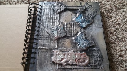
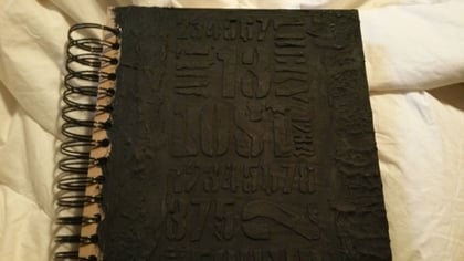
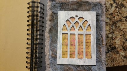
This first one is a Main intro page in a custom journal I am making for her. It is embossed using foil tape strips, and as you can see, after rubbing it with a black acrylic paint wash to age it, I then tried to apply some color to the butterflies hoping to make them stand out, but for some reason they just looked like crap, and the paint looked "slapped on". Same with the Explore font. I don't know what to do with it, or even where to go from here.
2. Journal Cover:
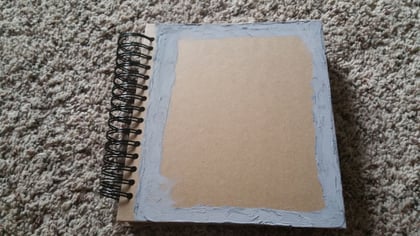
Next is the cover to the journal. Chipboard, I painted a frame of texture paste around the border as a start, and next I want to layer some burlap, or fabric strips, along with Tim Holtz tissue (Manage?) and then something in the center... But again, stumped... I cannot see things mentally. I am visual in that I must look at something to really imagine it. That sucks.
I am good with concepts, and ideas, but terrible at fleshing them out unless I have something to look at. So try as I might, I don't know how to make this cover look good from here.
3. Journal Inner Activity Pages
And:
So the idea behind the journal, is my wife used to complain she had no one to craft with, and how much she wished I'd do it with her. So my idea was to turn this journal into a "Year of Crafting Together". There are 6 major sections in the journal, so I purchased 6 different products she does not own, and turned each into a project we will make something with together. It's an exploration of different textures, techniques, etc. So one project will be wire wrapping custom pendants we'll then exchange, another is a large jar of texture pastes, creams, and waxes, and we have to make different items with the different textures... You get the idea. Some are challenges, some are easy fun.
And underneath the main pages, are little plastic folders. Within those folders, I wanted to slip some ATC's, and each had a little creative prompt for a mini-activity to keep her busy in between the big projects.
But looks at the ATC... See how ugly it is? I tried wrapping it in the Holtz tissue, and then adding some edging, but again, it just looked very tacked on. So not sure where to go from here with the ATC's, or if I should scrap the idea all together and just insert some simple note cards. I thought the ATC's would be more fun for her, but getting frustrated trying to make them look halfway decent.
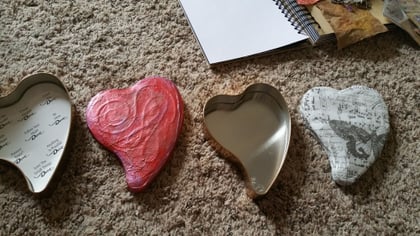
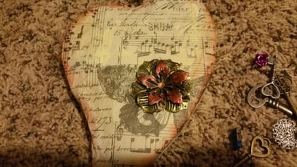
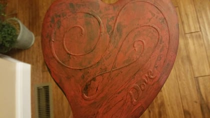
4. Heart Tins
These are Dove Truffled Heart chocolates tins. I covered the first with texture paste and alum. foil to give it texture and hide the DOVE lettering. I then rubbed it with a gilding wax. Now I'm stumped. I'm going to fill the interior with some of the gifts, so not quite as concerned with the inside as the out. But it looks so plain, as if it's missing something.
The 2nd heart was again, covered with tissue paper. I've really been trying to put that stuff to good use. lol - But now don't know where to go with it, or if I should rip it off and try something else.
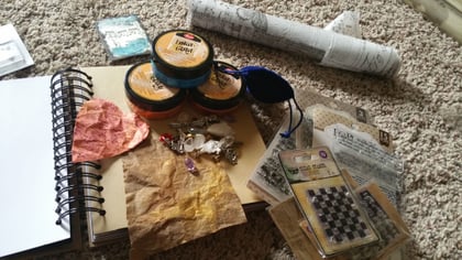
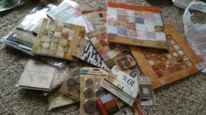
5. What I have to Work With
So these are some of the items I was really hoping to incorporate into the project. The pile of cardstock and ephemera? Well, I wasn't sure what to do about making these look great, so I panicked at Joanns and just raided the Holtz section, with some 7Gypsies thrown in. lol - I think I managed to get most of what they had. Didn't mean to, I just kept telling myself "what if you need this... Or what if you need that"? And filled the basket accordingly.
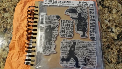
I also snagged a cool stamp set that I know she'd love. So it's technically a gift, but I wanted to find somewhere to use it on one of the items as well as a teaser.
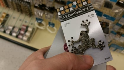
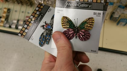
The metal embellishments I found at Hobby Lobby, and they looked cool. I thought the colors might offset one of the pages, or look good combined with the metal embossing? Don't know... Really would love your feedback. If you think I'm really heading down the wrong path with some of this, please, by all means let me know! I am wide open for feedback.
Just really want her to be surprised and impressed, and getting a bit worried I might be doing a butcher job on these projects. haha
Oh my gosh - this is AMAZING! What a sweet and thoughtful gift! I love the foil cover - amazing. Maybe can you add some more black paint to the word and then sand the top so it's really bright, but the shadows are really dark?
On ATCs sometimes I find I just have to keep going past that BLAH stage and then I'm happy. Are you going to add the prompt to the card? Maybe just a tiny envelope with the prompt in it would give it a finished look. And because I love blue I find a small splatter of a bright orange - just a few dots - really wakes it up.
You are going to be husband of the year - I can't get over what a kind gift this is for a creative person!
Wow - you're off to a great start. What I noticed on the cover is the same as what Lydia saw. There is minimal difference between dark and light. Consider shading around the pieces to give it more depth. One of my favorite mixed media artist is Vicky Papaioannou. I'd love to 1/8" of her talent. Look at the video around 5:28 and 11:53 to see how she adds shading. She uses a PITT brush marker but you can achieve the same with paint. I would also consider adding some more of highlights of the subtle color but then I favor brighter colors.
Your ATC isn't ugly, you just haven't finished it yet. Pinterest has tons of ATC ideas and click here for my ATC board. Maybe there is something that will spark your interest. Does your wife like flowers, butterflies, ??? Add one or more of her favorite things with a nice simple word like Love, Joy, etc. to let her know your thoughts of her.
The only thing I would do with the tins is fill it and just tie it with a couple wraps of twine. They are special the way you have them. Sometimes more is not better, it's just more.
Thank you so much! Very helpful! Yes, I'm planning on adding a heart or ICON on the front of the ATC, and then a prompt on the back when she flips it over. I love the idea of a mini-envelope, I'll definitely give that a shot. I'm trying to mix them up a bit so that they're not all the same. Thank you for the awesome idea.
I'll try the few splashes of color as well. I think I have some oranges in here, but most of them are shimmers or metallics. So maybe a quick Michaels run. I'll post pics once I add some of what you recommended. Here's hoping!
Quote:
Originally Posted by UnderstandBlue
Oh my gosh - this is AMAZING! What a sweet and thoughtful gift! I love the foil cover - amazing. Maybe can you add some more black paint to the word and then sand the top so it's really bright, but the shadows are really dark?
On ATCs sometimes I find I just have to keep going past that BLAH stage and then I'm happy. Are you going to add the prompt to the card? Maybe just a tiny envelope with the prompt in it would give it a finished look. And because I love blue I find a small splatter of a bright orange - just a few dots - really wakes it up.
You are going to be husband of the year - I can't get over what a kind gift this is for a creative person!
Thank you for sharing. I checked the video, and you're right - She has some amazing vids! I actually watched 4 instead of just the one, trying to absorb what she's doing and why.
I think I overwhelmed myself on Pinterest though. I setup a board, and within 1 week I have several hundred pins, and really just hit overwhelm stage not knowing which to try.
That's what drove me here - As all this direct feedback is helping to focus me on what needs work. She definitely loves butterflies, birds, flowers, etc. Would you recommend I add some of those things as:
a. Stamp
b. Sticker (I have some rub-ons)
c. Embellishment of some sort (I have metal, and some fabric winged butterflies)
d. Emboss and color it
Just trying to figure out which makes the most sense, or is it just personal preference? Have my learning hat on here.
Thanks again for taking the time to help a confused person out.
Quote:
Originally Posted by stamphappy1650
Wow - you're off to a great start. What I noticed on the cover is the same as what Lydia saw. There is minimal difference between dark and light. Consider shading around the pieces to give it more depth. One of my favorite mixed media artist is Vicky Papaioannou. I'd love to 1/8" of her talent. Look at the video around 5:28 and 11:53 to see how she adds shading. She uses a PITT brush marker but you can achieve the same with paint. I would also consider adding some more of highlights of the subtle color but then I favor brighter colors.
Your ATC isn't ugly, you just haven't finished it yet. Pinterest has tons of ATC ideas and click here for my ATC board. Maybe there is something that will spark your interest. Does your wife like flowers, butterflies, ??? Add one or more of her favorite things with a nice simple word like Love, Joy, etc. to let her know your thoughts of her.
The only thing I would do with the tins is fill it and just tie it with a couple wraps of twine. They are special the way you have them. Sometimes more is not better, it's just more.
Thank you for sharing. I checked the video, and you're right - She has some amazing vids! I actually watched 4 instead of just the one, trying to absorb what she's doing and why. I agree there is so many cool things to learn from her. I usually just select one thing she does and then I go practice. A lot my time is spent just playing and then I keep my samples of reminders of what to do and not do. I'll use the "good" things for future use and the others usually end up in the trash to keep down the clutter. But sometimes the ugly stuff can be used in another way.
I think I overwhelmed myself on Pinterest though. I setup a board, and within 1 week I have several hundred pins, and really just hit overwhelm stage not knowing which to try. I have a lot of pins but they are really just for ideas. I try not to post things just because they are cool. I try to keep my posts to things I'd really like to try. The funny thing is that I only look at my pins when I can't come to an idea on my own. Pinterest is my backup.
That's what drove me here - As all this direct feedback is helping to focus me on what needs work. She definitely loves butterflies, birds, flowers, etc. Would you recommend I add some of those things as:
a. Stamp
b. Sticker (I have some rub-ons)
c. Embellishment of some sort (I have metal, and some fabric winged butterflies)
d. Emboss and color it
Going out on a limb here because this is based on my personal style. I would:
I'd soften your edges by blending with ink and a sponge to soften the dark edge of black edge as it goes to the middle of the ATC. Not to dark, just a soft touch using a soft grey.
Then I would soften the background music paper by using a light wash of white paint or white gesso so it fades to the background. Let it dry and then stamp a butterfly or flower. I probably stamp it so it would be on half of the ATC. Or you could tear out the butterfly from the tissue paper and glue it down with mod podge.
then I'd add some of the turquoise into the butterfly wings and maybe add a touch of either green or purple and blend it into the turquoise. Don't try to blend the green and purple, it makes mud. Instead blend the green and turquoise and then go to the purple next to the turquoise.
Just trying to figure out which makes the most sense, or is it just personal preference? Have my learning hat on here.
Thanks again for taking the time to help a confused person out.
Hope I didn't go to far and of course this is just my ideas so not sure it's worth all that much.
Hope I didn't go to far and of course this is just my ideas so not sure it's worth all that much.
Not at all! Perfect! Very helpful! Copied and pasted in my files for future reference as well. I never thought to lighten the notes and tissue imagery to make it fade in the background a bit, but now that you brought it up, I looked at some of the good looking ATC's I was comparing mine too, and it's all too obvious they all did indeed do something similar. Huge breakthrough! I can see how this technique will come in handy in all sorts of areas as well Thank you so much. :p
oh yeah, Husband of the year award is foreseen in your future
I think this is just totally awesome.
and I really don't have anything helpful to add right now, but I am looking forward to see the next round of mug shots.
Haha - Stacy, she totally deserves it. She's an amazing wife! I also believe joint-hobbies and often trying to surprise and do personalized gifts/activities for the other person keeps both parties involved and focused on what they both like and love about each other instead of the negatives. And I'm actually having fun while doing it, so zero complaints here.
Plus, I always see her putting in long hours making customized gifts for friends, so thought it'd be nice for her to get something that shows a lot of thought and effort went into. The hope is it'll give her projects to look forward to throughout the year, and she'll have a crafting buddy for a change. Hoping to surprise her with some of the techniques I'm learning when making things. Maybe I'll get to be the teacher a few times if I retain most of this. haha
I'll try to snap some shots as I make improvements to the pieces and add some more. Right now working on the wire wrapped key. These tiny wires aren't cooperating though with the colored plating rubbing off when I try to braid the metal. I'm quickly learning that crafters must be monumentally patient individuals? Or at least learned to be over time? ;)
Oh my goodness how blessed your wife is to have you! My heart just melted at how lovingly you are going to all this detail for her. Like Stacy I have nothing practical to add, just how wonderful it is that you care so much abut her passion for crafting that you would go to such lengths.
Ditto on what Cardmaker said.
"Pinterest....Overwhelmed" .....TRUTH!
Have you seen any Tim Holtz videos. He really does work in the style you are going for. Since you have so many of his products, you can see how he uses them. It's fascinating.
Have fun with your lucky wife!
What a lovely idea for a gift - lots of brownie points in the bank for you, I think! You're off to a great start, too.
For your foil tape textures, you might find it helps to get slightly sharper definition round your objects (the word in particular looks a little hazy). I find a paper stump (the type used by artists for blending pencils) is a perfect tool. Take your time to "draw" round each object and really get the tape to stretch so the edges of your die cut are good and clear. Then your paint will wipe back nicely off the high spots and stay dark in the crevices, helping the contrast.
If you're ever really unhappy with paint over a foiled texture piece like that, you can always take the whole lot off and try again. A bit of rubbing alcohol on a rag or piece of kitchen towel will shift acrylic paint, no problem.
I agree that the ATC is not ugly, just not finished! To me, it looks like it needs a focal point of some sort - a butterfly or flower would work well and the small scale of an ATC is perfect to experiment a bit with placement. Try placing the image so it goes off one edge or the bottom of the space so the eye works with the imagination for a continuation. If you're going for a stamped image and you want to "try out" before committing yourself, stamp it onto a piece of acetate or clear packaging and lay that over the ATC and move it around to get an idea of how it looks in different places. That should help with your need to see things ahead of time.
On the tins, I think contrast might be your friend in making them feel more finished. The texture on the first looks great - could you maybe bring it out a bit more with a gilding paste in a contrasting colour (gold or silver would work well over the red base, I think). The tissue works well on the second one and I'd be tempted just to add a pop of colour to the butterfly. Alcohol ink or marker should do the trick assuming you used something like Mod Podge to attach the tissue which will have made the tissue of not a non-porous surface.
Hope you and your wife have lots of fun working with this!
One thing I'd say about Pinterest is to limit how many pins you put on a board. Start a second/third if necessary. Not many of us will ever scroll all the way to the bottom of a 700 pin board! I try and limit each board to around 200, that way I know there is more chance of actually seeing them again!
I'm not going to offer advice on your projects- I've just stated working on a book cover, and it's taken me 3 weeks to get past the tissue covered in Gesso stage! And I've been stamping for around 20 years,, but I'm still finding this a little out of my comfort zone!
You do realize you'll have a lot of angry husbands on your back after the women here show them what you're doing for your wife? ; )
I don't see the ATC - where is it??
You said, "I am good with concepts, and ideas, but terrible at fleshing them out unless I have something to look at."
Most techniques can simply be learned, step by step. But to have ideas, and to experiment fearlessly, puts you way ahead of the game - and the frustration many have.
BTW, if you ever get to the Maryland area, the owner of The Queen's Ink is an amazing artist and crafter, and has unusual classes - some that she and her staff teach, and some by guest teachers like Dyan Reaveley (coming up soon), Seth Apter, Kristen Powers (Kae Pea/Rubber Moon Stamps) and others in the mixed media realm. 302 Found
Reading a bit about color might make you more comfortable, just the basics, and why red and green, violet/yellow, orange/blue make mud. (Hint: there is no brown on a color wheel. That's how you get there.)
Wow, thanks a ton again! Very helpful! I agree that the word looks a bit hazy underneath the foil. It looks good and clear only from a certain angle, and that's been bugging me. I have 3/4 of the roll of foil tape left, so I might rip it off and try it again.
I snagged a set of embossing tools from Michaels and used that to try and depress the details and edges a bit, but after a certain point, the foil began to crack a little and I backed off not wanting to make it worse. Wondering though if I try doing what you said early on, instead of after I've rubbed down the entire page with the tool? I'll give it a shot.
Great idea with the acetate! That'll save me from being hesitant but still give me a visual. Brilliant suggestions.
Quote:
Originally Posted by Angelnorth
What a lovely idea for a gift - lots of brownie points in the bank for you, I think! You're off to a great start, too.
For your foil tape textures, you might find it helps to get slightly sharper definition round your objects (the word in particular looks a little hazy). I find a paper stump (the type used by artists for blending pencils) is a perfect tool. Take your time to "draw" round each object and really get the tape to stretch so the edges of your die cut are good and clear. Then your paint will wipe back nicely off the high spots and stay dark in the crevices, helping the contrast.
If you're ever really unhappy with paint over a foiled texture piece like that, you can always take the whole lot off and try again. A bit of rubbing alcohol on a rag or piece of kitchen towel will shift acrylic paint, no problem.
I agree that the ATC is not ugly, just not finished! To me, it looks like it needs a focal point of some sort - a butterfly or flower would work well and the small scale of an ATC is perfect to experiment a bit with placement. Try placing the image so it goes off one edge or the bottom of the space so the eye works with the imagination for a continuation. If you're going for a stamped image and you want to "try out" before committing yourself, stamp it onto a piece of acetate or clear packaging and lay that over the ATC and move it around to get an idea of how it looks in different places. That should help with your need to see things ahead of time.
On the tins, I think contrast might be your friend in making them feel more finished. The texture on the first looks great - could you maybe bring it out a bit more with a gilding paste in a contrasting colour (gold or silver would work well over the red base, I think). The tissue works well on the second one and I'd be tempted just to add a pop of colour to the butterfly. Alcohol ink or marker should do the trick assuming you used something like Mod Podge to attach the tissue which will have made the tissue of not a non-porous surface.
Hope you and your wife have lots of fun working with this!
Ok, so last night was a marathon of work trying to get as much finished before she gets home tonight. Apologies I didn't get to implement any of your brilliant ideas and suggestions on adding color, etc just yet. My hopes are that I'll be ready for that this eve.
However, I did get the following wrapped up:
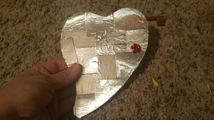
1. Heart Tin Interior
I had seen a project on Pinterest where someone made a metal patchwork heart that looked stunning. Try as I might, I could not resist trying it myself with a little twist.
The heart is not finished yet, as I have not smoothed it out, nor added the interest to it with the embossing tool or an ink wash. But to be honest, I was just thrilled I got the majority of it knocked out and can detail it later.
I wanted the patchwork foil sections to really look dimensional, so I took my foil tape, and reclaimed an empty cereal box of Honey Graham Oh's (Tastiest cereal around BTW) and armed with a bowl of cereal, the tape, and scissors, I laid the tape onto the cereal box and cut it into pieces to make some metal card-stock.
Next, I glued the pieces to the Dove Chocolates insert and then cut around the edges after I was relatively happy with the overlapping look.
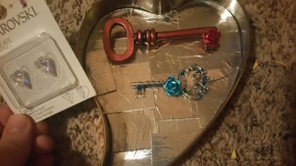
Now I threw in the next pic to show what I'm thinking of inserting inside this tin.
The blue key I wire wrapped, and the red I haven't begun wrapping yet. This was my first key wrapping experience, so I know it might look a bit rough, but I'll do some practicing before I begin on the larger key. That one was bronze, but I rubbed it with some Cosmic Shimmer Gilding Wax.
I think the red over the bronze gave it a striking, deep finish. But I'm wanting to make sure that the little crystal hearts and the red flower embellishment will go well with the deep red?
If so I'll try to get it wrapped and added tonight.
Oh, I also got the first mini-activity page finished as well. Once she claims her key from the heart tin, she'll turn the page to see:
So it's kind of an interactive experience when she uses the journal. I've taken 6 of her gifts and wrapped + numbered them, but she cannot open them until she gets to that particular activity.
This particular mini-activity is creative writing, where I wrote out a writing prompt, and she finishes the short story about what this key is, where it came from, and what it opens. I think that'll make the key more meaningful as she'll remember the story every time she wears it.
That's the idea anyhow. So that's where I left off last night. More to come!
Thanks again to all of you. So glad I found this forum! I'll put a note in the Journal as "co-created by SplitCoastStampers"
Oh, my apologies! Haven't delivered yet, still working on it all. It's a Valentines gift, and still a lot to go. Sorry I was unclear on that. My reason for pushing to get as much finished before she came home is it's difficult to be as productive when I'm trying to hide all the supplies and work in a room with the door shut. lol
So much easier to spread everything out on the table, turn on some music, and just experiment. If I can get enough finished, I'm extremely impatient and doubt I'll be able to wait till Valentines Day though, and likely end up giving her half of it early. Same happens on Christmas.
Ok, so lots of updates. Some good, some not so much. But at least progress is being made!
So I finally picked a cover for the Craft/Activity journal.
I went with a Holtz stencil and threw on some texture paste, and added some extra gritty paste to either side. Once dry I'll paint the whole thing black and accent with some metallic Inka Gold. I'd seen someone do something similar on Pinterest, and loved the way it turned out, so we'll see how this one goes.
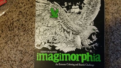
Next, I moved on to activity 2 in her journal, and here's what I came up with:
Neither of us have tried out a adult coloring book, but this one looked really interesting and gets amazing reviews. So I bought it, and am creating an ATC with the activities for her. So for month 2, she gets to pick 1 image for her, and 1 for me that we'll color together with a set of Prima watercolor pencils I purchased. Also, after some thinking, I figured this might be a good exercise for me to learn color selection better?
Each activity is supposed to be about trying something new, and I bought the supplies to make it happen, so we'll get to experience water color pencils for the first time. Prima seemed to get a lot of great reviews, so ordered a few sets. Just in case, I bought a set of regular color pencils as well. I've heard it can be difficult to really get fine detail right with the WC pencils, and this book is filled with microscopic images, so a backup seemed the right thing to have on hand. haha
Have some mini-activities setup as well, but no progress on them yet.
Also got a box in for Month #3 - Angelina Film. I saw some videos of all the cool things you can do with Angelina, and bought a package of 10 colors we can experiment with during month #3. Pendants, chipboard, ICE Resin, and embossing are the mini-activities to explore with the Angelina. I've seen some embossed cardstock combined with Angelina, and it looked amazing, so I'm really looking forward to trying it out during month #3 myself.
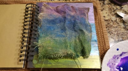
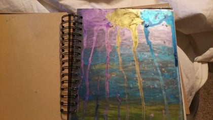
So the main page for Month #2 was finished with Inka Golds. When I finished, here's what I ended up with:
All that color sitting on the plate seemed like a waste. So I decided to try and layer my page using burlap along with a fabric tie off baggie I grabbed from Michaels that morning. I first painted in the baggie:
Next, I tried using the Inka Gold water as a wash on the burlap:
I keep hearing how important layering is, and mixing up textures, so this was my newbie attempt. I just threw the color on, and balled the burlap up hoping to transfer some of the color a bit.
After doing this, I could see it looked like I was sticking too much with one theme/pattern, but unfortunately I wasn't sure how else to incorporate more colors/patterns, or really what to do, so I just went with it.
The baggie I had painted was dry enough now, and it was supposed to be the top layer and then filled with various mini-scrolls and ATC's of the month activities. But again, I see this plate full of color, and decided to wet down the fabric baggie, and hoped it would absorb the inka gold wash:
It worked, you'll see in pic #2 it absorbed the water, but washed it out so it looked more like a water color than a metallic gild. I liked the effect, but could see immediately that using this blue that was already dominant in the previous layers was likely a bad idea. Too much.
So I re-wet the baggie, and in pic #3 you can see I tried the Hematite Inka Gold. I sit back and look at what I made, and while it's not horrible, I can tell something is not right. I really don't like the 3 layered approach I took to the background, and honestly, I didn't want to go that route to begin with.
However, I wasn't really sure how to create anything else that would look good, so decided that maybe I should keep it simple and just get some color on the page and the rest would come to me.
Now I'm thinking that was a mistake. lol
I'm not too upset over it though, because I know it's the thought that counts, and the page is more about showing the effort that went into it rather than impressing her with skills.
But still, it'd have been nice to end up with something that she'd be impressed by. On a positive note, I do feel I learned some things making this page, so it's not a total loss.
In fact, I bought two of the baggies and have 10 more yards of the burlap so I can always start over on this page if need be. Thoughts? Should I remove the background and re-paint the baggie and swap out the burlap for a fresh start?
Sorry to ask so many questions in this thread, but it's difficult not to with all you experienced crafters around.
Wow. I am overwhelmed just taking all this in. This is one of the most thoughtful things I have seen a spouse do in a lot of years now. Kudos!
First of all-you are trying to accomplish in a month what it takes people months/years to do--so dont be hard on yourself. This is what every newbie goes through. along with dumping more in the basket than you first intended to LOL.
You dont have to use everything on everything. There is beauty in clean and simple too. (aka CAS)
Also...this is art. We cant tell you what we think is ugly or good-that's for you. but having said that, of course we can give opinions on tweeking. What I am noticing is that this feels very masculine to me...but she may lean in that direction, I dont know.
Can you put your hands on any of her work that she is happy with to show us so we can see her style?
Second...what resonated with me most in your original statement is that she wants "someone to work with"....doing things with her will be such a gift in itself...some people work well alone and others do better in company. If you are group 2 but dont have anyone, it is very hard and sad to try to do it...just having a person is SO incredible in itself. For it to be your SO just escalates it.
I might back off Pinterest and head over to "You Tube University" where you will see whole projects from start to end, product discussions and ratings, and technique tutorials. You can bookmark them to be able to go back to them. Just be warned-this is HIGHLY addictive and you totally can lose whole days surfing there.
Ok...let's get down to it. What exactly are you giving her?
a) A journal-with ATC project cards.
b) heart tins
Anything else? I dont mean that as in "that's all?" b/c I think that is a lot. I mean that just as I want you to be clear/focused about what your end goal is and not to get caught up making another thing and another thing...and ending up with a huge crazy pile. Let's remember now--the REAL gift here is going to be your TIME which frankly is PRICELESS...you have the rest of your lives to explore all kinds of products and techniques! This IS a very fun and endless pursuit. The way you think you cant wait to show her...that is how we feel about this and why we lament never having enough time for it. I think it's in your blood already!
You dont have to use everything you bought. You guys can explore things together.
I hope I dont sound like a downer...I am just trying to get you focused. You feel scattered to me.
Absolutely, thank you so much for the feedback WaveJumper, I always appreciate a straight-forward approach. Very insightful feedback!
I'll do my best to answer:
1. For the style(s) she likes, she constantly tells me she loves Tim Holtz vintage styles. She owns most of his products, so I'm pretty confident that she'll like at least the stenciled cover. Not sure on the other items I made just yet.
However, she also has a wide range of likes, and I know I've seen her create fantasy styles as well - As in princesses, unicorns, etc. with lots of bright and cheery colors. Oh, and ocean/beach/nautical scenes seem to be a repeated interest of hers.
And then everything in between. haha - So to help maximize the chances she'll like at least some of the work, the other 9 cover pages will incorporate some of the others. I purchased some chipboard I found on Etsy that includes castles, a pegasus, and some flourishes, etc. I'm hoping I can make something decent with those.
I'll keep posting here for feedback though to keep me on track, because I'm not good with styles, and am concerned what I make might reflect what looks good to me, as you said, more masculine. So thanks for pointing that out.
For the gift:
1. Journal with the year of projects and mini-projects
2. Heart Tins which contain the wire wrapped keys I made + pieces for her to choose from so we'll make one together and exchange for Valentines Day
3. I kept a list over the last few months of crafting items I heard her mention she thought was cool. So I snagged those items and some more I thought were neat. (I think the neatest were the M-Bossabilities 3d folders. Never seen those before, so grabbed those too for her Big Kick) The other that I think is really intriguing is I stumbled across a silver and bronze prescious metal clay kit for us to try. Never knew you could make PM jewelry and pendants/art from clay before! Should be fun, (Or funny). lol
4. Home-made sushi (Her favorite meal in the world) dinner together.
So that's where it's at right now. Your observation on "scattered" is dead on. I've been all over the place trying to get it all finished whilst researching and learning at the same time. Not a downer at all, I always appreciate a nice re-focus.
I really am excited about doing these projects with her. The only problem will be waiting for the next months project will feel like forever.
Quote:
Originally Posted by wavejumper
Wow. I am overwhelmed just taking all this in. This is one of the most thoughtful things I have seen a spouse do in a lot of years now. Kudos!
First of all-you are trying to accomplish in a month what it takes people months/years to do--so dont be hard on yourself. This is what every newbie goes through. along with dumping more in the basket than you first intended to LOL.
You dont have to use everything on everything. There is beauty in clean and simple too. (aka CAS)
I hope I dont sound like a downer...I am just trying to get you focused. You feel scattered to me.
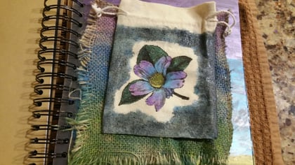
Took the advice given by others in this thread, and modified the heart tin a bit. Here's what I have so far. I added a thinned out white/yellow mix to dull the background a bit, and then threw some black into the mixture to add some random brush stokes.
I added an inked border with some red brick and then black. I can tell I need to work on that technique a bit more. But I do see some visual improvement. The flower was all one color, so I painted it with some thinned down inka gold and that looks more interesting now IMHO.
Still need to do some more work to it, but I can see it coming together more now vs. the original. Thank you all for the advice!
While I was painting, I grabbed one of the keys she'll be getting in the tin, and painted within the bevel with a metallic purple. It was all one color, an aged bronze. Now I'll rub the edged with a black, or hematite. I really like the way the purple looks inside that bevel though. Pleased with how that piece is turning out thus far.
The ATC's have been modified as suggested as well. I'll have to grab some pics of those later though. Just wanted to get these updated in here.
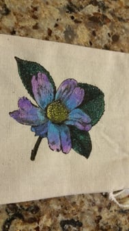
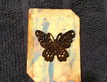
I took the advice from earlier and watched a few videos, and did my best to dress my first ATC up. Here's where I left off.
I know it's very simple, and the distressing is pretty plain, but it's the best I could do for now. I added a chipboard butterfly that I painted black to see if it fits with the back-ground of the card.
I'm pretty happy with how the butterfly goes with it. I wanted to try to make it look better, but I'm going to leave well enough alone for now until I learn more technique. For now, I'm calling ATC #1 "FINISHED"!
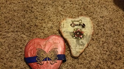
2. Heart Tins
I just laid some embellishments on top of the tins for now to see how they'd look. For the red tin, I put a blue ribbon and unpainted chipboard piece on top. If I go this route, I'd purchase and stain a better ribbon. This one is a bit small and plain?
I'd also paint the chipboard, but not sure what colors would look good with the red tin yet?
The wrapped tin has the painted flower and two keys attached above. At least that's what I've come up with thus far. I am open to suggestions on what might look better. ;)
3. Tin Heart Fillings
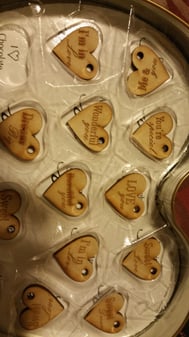
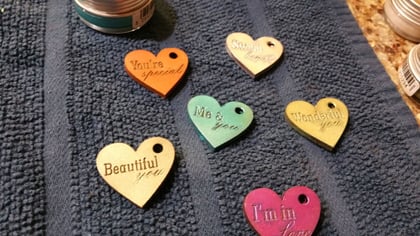
I ordered a set of wooden hearts with inscriptions on them. I used the CS gilding wax to give them their first coat, and they're turning out nice IMO. They fit perfectly inside the chocolate tray from the dove chocolates, so I'm going to color the tray and make it a part of the experience, as it's too good of a fit to ignore! I was pleased with this happy accident. Haha
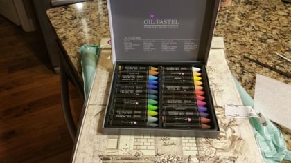
4. I've not been doing too well with ink so far. I just don't seem to get it to look the way I want. But in the past, I used to draw and paint fairly well, so I picked up some Prima Oil Pastels and will use them with a brush to see if I can get better backgrounds with the remaining pages in the book. Stoked about playing with these. Anyone else use pastels for backgrounds, or detail work? Hope I made a good choice. Read a lot of reviews, and people seemed to be happy with them.
5. Inchies and Month 5
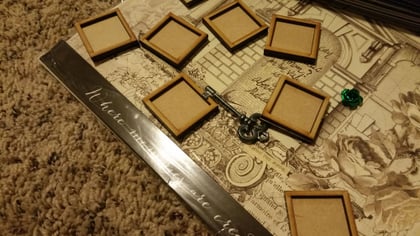
So more chipboard and wood pieces arrived. For month 5, the planned joint-activity is we will make some inchie shadow-boxes together. I stumbled across the concept of inchies on YouTube, and thought it'd be a fun activity, but even more interesting if done as shadow-boxes. Ran across these, and had to order a pack. The cover page to month 5 will explore her love of fantasy elements. So I placed it on the page to see if I can envision a nice layout. Still working on it, but the chipboard looks great. Will have to figure out a good color for it. Any tips on painting chipboard?
That's it for today. More on the way, a full weekend of working on this stuff planned.
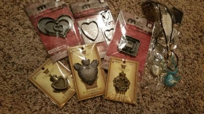
My mistake... Wrong pic for the inchies in the above post. Here they are:
Don't they look fun?
And yes, I realize most my pics are taken on the floor... I do indeed do most things sitting on the floor, as I find it difficult to sit still in a chair. I lay everything out on the floor, and it helps me get a better sense of what's what. Odd I know, but it's how I have to work. ha
Splitcoast Dirty Dozen Alumni Creative Crew SU Design Team Alumni
Join Date: Aug 2008
Location: Chicagoland
Posts: 15,348
Likes: 0
Received 0 Likes
on
0 Posts
I have no advice because I'm so not good with anything other than stamping a card but this is quite possibly the best thread on SCS ever and she is a lucky lady!!!!!
My hubby did stamp cards with my supplies when he proposed. I didn't even get mad at him for using my ribbon scissors on paper, LOL!
Awesome Minders! That's awesome he did that! Personalized gifts are always the best!
Near disaster today, (Metallic paint spill on carpet) but also got a lot hammered out, so feeling pretty good! I gave up trying to wait for V-Day, and asked if she'd mind getting her gifts this coming weekend, so it looks like Saturday is the big day, and I have to haul butt to get a ton more work finished.
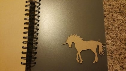
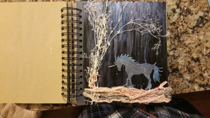
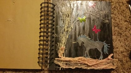
So I did get the next months cover page in the journal finished, this is the one with the Unicorn. Took the chipboard and added some blue embossing powder, and then edged the tips with gold:
But I'm undecided, does it look better with, or without the metallic butterflies? Definitely could use some opinions here:
Next, here's the next cover page using a combo of chipboard, and angelina film. I used some semi-dry glue as a base to get the crackle effect on the paint after watching some YouTube vids. The boarder is not painted yet in this pic:
Got restless waiting for the paint to dry on the previous page, and decided to experiment with more crackle effect on yet another Dove chocolate tin. Just wanted to see what it'd look like with a darker red on black paint base:
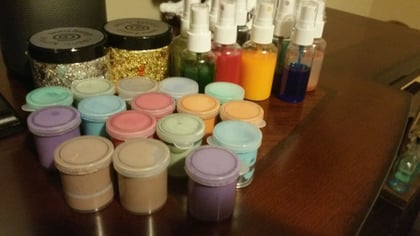
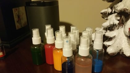
Also made some home-made texture paste colors and sprays for her to mess with. Had so many supplies sitting out, and was still waiting for everything to dry, so gave it a shot to see how it'd turn out. Going to make up some labels and give them goofy names to make her laugh. My personal favorite, is the brown came in really grungy looking, so I'm naming it: "Oops I shat myself Brown". lol - Looking for some official looking labels I can print that onto to make it more funny.
So that's about it for now. Feeling good with the pace, but a bit concerned whether I'll have it all done in time. Will certainly give it my best.
Hah, here I was about to say "without" which goes to show you can't please all the people all the time!
FWIW, I like the moody and slightly mysterious look of the version without. If I was going to put butterflies on, I'd probably go for silvery ones to keep it more ethereal-looking.
Just jumping back to the Oil Pastels. I've used them to make backgrounds, just smudging with my fingers, but to stamp on I found Staz-On was the only ink that would dry on them. These were just Artist Oil Pastels, so don't know if the Prima are different.
Thanks everyone! Great feedback and tips. I do have some Stayz on here, I'll give it a try on the Prima. One think I also ran into yesterday, was I purchased watercolor paper for the first time since my cardstock warps badly when I get it wet. I tried using a detailed DarkRoom Door stamp, and it came out pretty bad due to the ink not getting into the grooves of the paper.
Is this typical when stamping on watercolor paper? Or did I just not get enough ink on the stamp per chance?
Watercolour paper generally has much more texture than stamping cardstock so yes, you're much more likely to get a "hit and miss" effect which will really show on detailed lines.
It's worth understanding the different types of watercolour paper - hot press is the smoothest surface (and generally also the most expensive) with Not and Cold Press being much bumpier. The Ranger watercolour cardstock, if you happen to be using that, is smoother on one side, bumpier on the other so choose which side to stamp on. Being aimed at crafters, they're not using the usual artist terminology but it's closer to Cold Press.
A tool like the MISTI helps because you can ink again and stamp in exactly the same spot but may not be a suitable option if you're working on a journal with bound pages or typically other 3D items.
I concur with Angelnorth in that watercolor papers vary in texture between hot press styles & cold press styles. Hot press has a much smoother texture, so accepts stamped images easier with less gapping in the stamped lines.
But, the cold press textures are great for creating a variable color effect with its own texture coming thru the color. Cold press texture really adds to the simple inked background in this example:
love following this! your wife is a lucky lady to have such a considerate hubby! I am commenting to vote no for the butterflies with the unicorn. I think it takes away from it. Great job you're doing, hoping your wife appreciates you!
OOO I just have to comment...I am loving all the pictures of your projects...they are a treat for the eyes! Your heart boxes and the textured journal are amazing! Sounds like you're having so much fun. By the way....we do have a Mixed Media challenge on Fridays here....just saying...you may want to check it out and post some of your projects in the gallery...we would love to have you join in :p